Case Study - Infinite Campus
Reframing school lunch fund payments - transforming a legacy checkout flow into a mobile-first funding experience
Project Overview
Parents rely on school lunch accounts to ensure their children have consistent access to meals. Yet the existing replenishment experience followed a traditional e-commerce checkout pattern forcing users through a multi-step “add to cart” process that conflicted with their mental model of simply adding funds.
As a parent who uses Infinite Campus weekly to manage my son's lunch account, I experienced this friction firsthand and I redesigned the flow to reflect how parents actually think about this task.
This redesign reframed the experience from a commerce flow into a direct financial action flow reducing friction, improving clarity, and increasing transaction confidence.
Role: Senior Product Designer
Platform: Mobile Web
Scope: End-to-end payment flow redesign
Focus: Reduce friction, increase funding completion, strengthen trust
The Problem
The existing experience was structured like online shopping:
Select account
Enter amount
Add to cart
Proceed to checkout
Select payment method
Submit payment
View receipt
This created several issues:
Misaligned mental model (“Why am I adding lunch money to a cart?”)
Excessive steps for a simple financial action
Poor mobile optimization
Weak confirmation feedback
Low trust signaling during payment entry
For parents often completing this task quickly between other responsibilities. This friction introduced hesitation, abandonment, and unnecessary cognitive load.
Business Risk
This friction created measurable operational and financial risk.
Increased drop-off in funding flow
Higher support inquiries related to payment confirmation
Delayed funding → negative account balances
Erosion of trust in financial handling
For districts operating at scale, even small inefficiencies compound quickly.
Constraints
Legacy system architecture tied to cart-based logic
Required service fee disclosures
Multi-account household handling
Limited engineering bandwidth
Must work within existing design patterns
The challenge wasn’t visual polish, it was restructuring within system constraints.
Research & Insights
Methods
Heuristic evaluation
Flow audit
Competitive analysis of digital wallet and fintech flows
Review of payment-related support themes
Key Insights
Parents expected a 3–4 step funding process.
The cart metaphor created confusion and unnecessary steps.
Balance visibility was inconsistent across screens.
Confirmation lacked emotional reassurance.
Payment method selection felt buried rather than integrated.
Most importantly:
Parents were not “shopping.” They were performing a high-trust financial action tied to their child’s well-being.
The flow needed to reflect that seriousness and simplicity.
Design Strategy
We reframed the experience around three principles:
1. Task Over System
Eliminate commerce metaphors and align to “Add Money.”
2. Reduce Decision Fatigue
Use preset funding amounts to accelerate action.
3. Increase Financial Trust
Strengthen confirmation states and payment clarity.
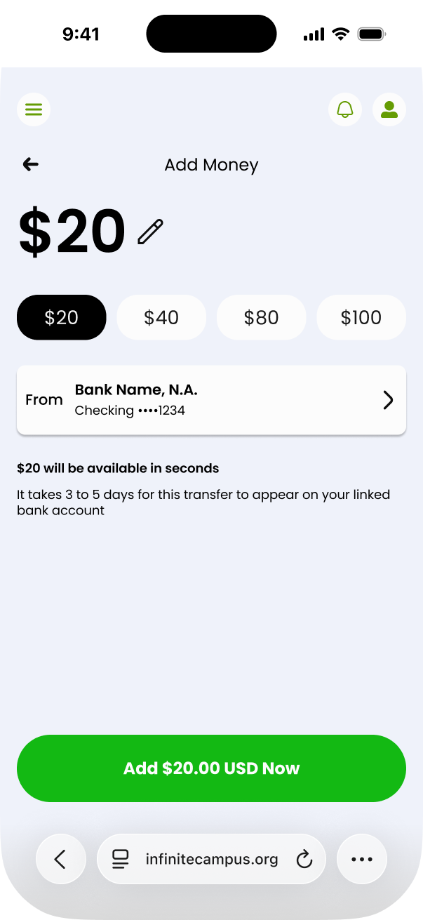
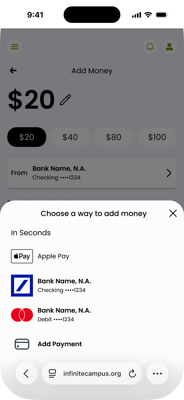
The Redesign
-
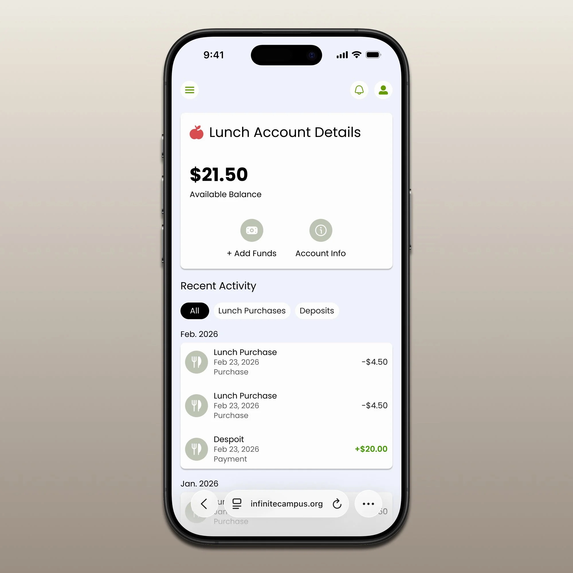
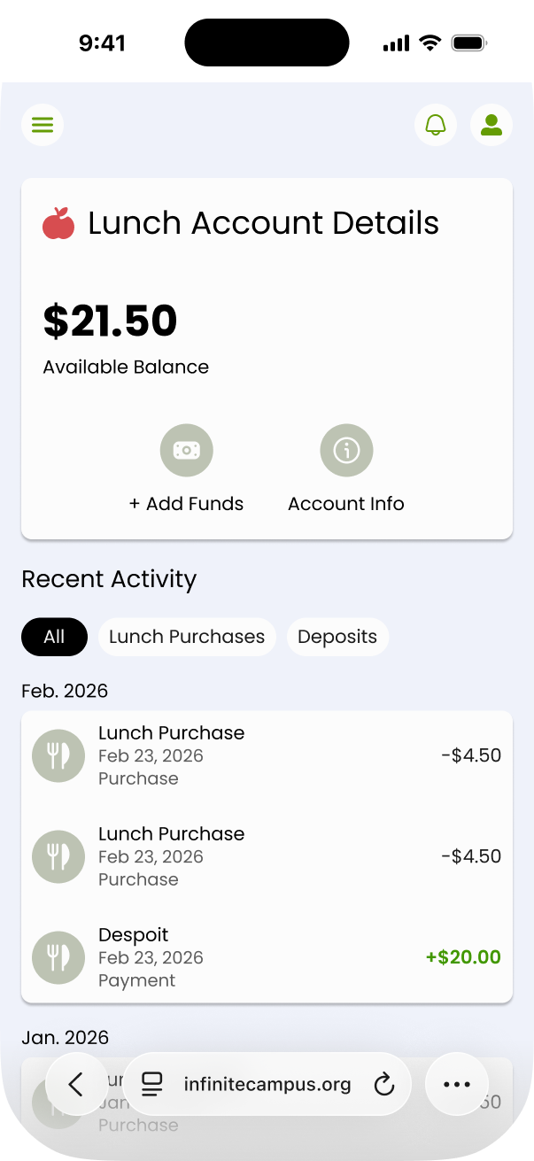
The available balance is visible upfront and throughout the flow.
Impact:
Anchors user context
Reduces uncertainty
Encourages higher funding amounts
-
Removed “Add to Cart” entirely.
New flow:
Select or edit amount
Choose payment method
Confirm transaction
Immediate success state
Steps reduced from 6–7 to 4.
-
$20, $40, $80, $100 quick-select options
Behavioral effect:
Speeds decision making
Reduces hesitation
Nudges toward higher average deposits
-
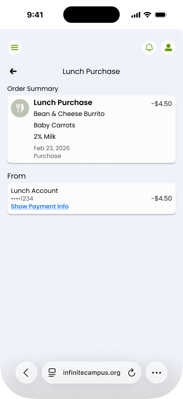
Payment methods are surfaced directly within the funding context, not hidden behind checkout screens.
Effect:
Improves clarity
Reduces abandonment at payment step
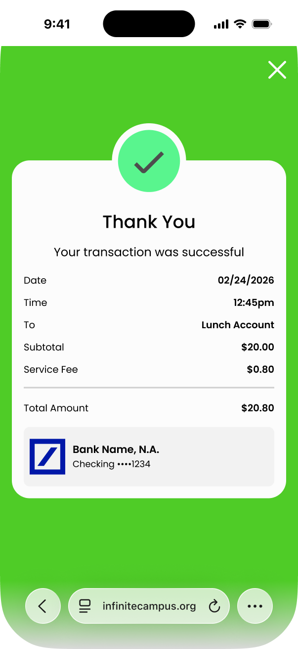
-
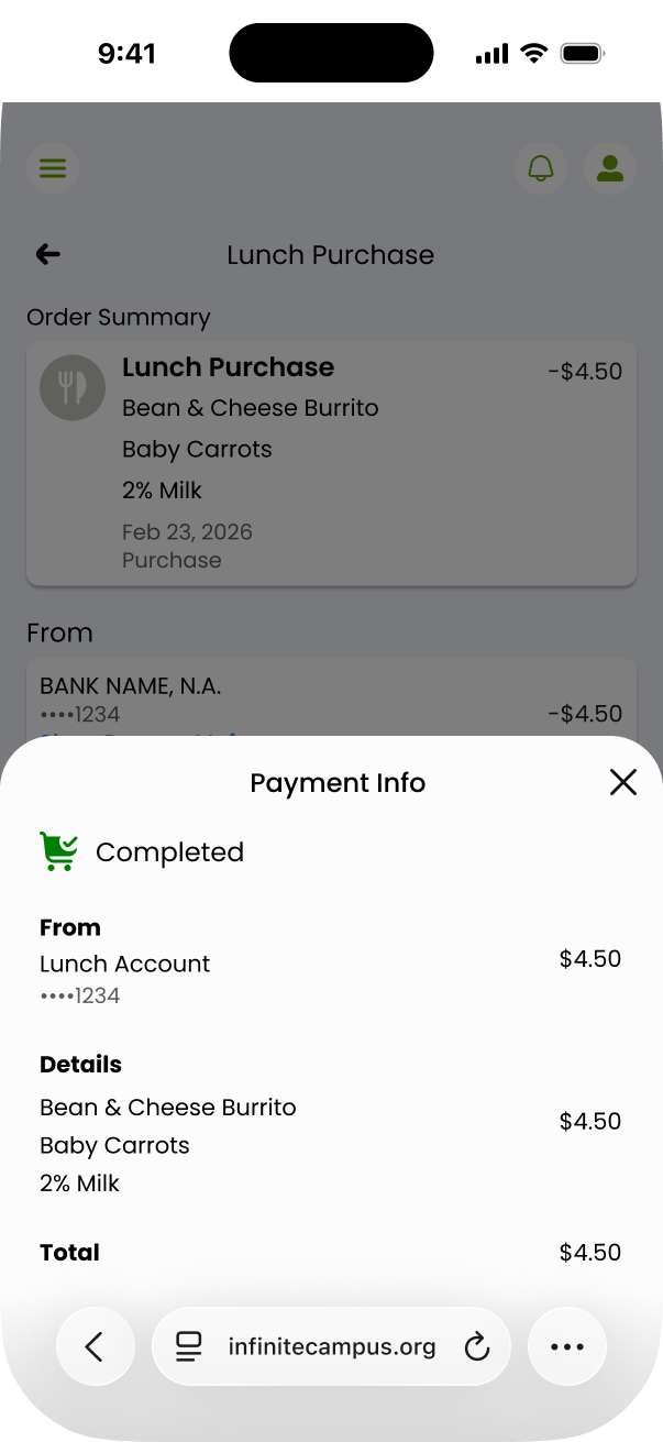
Large confirmation screen with:
Visual checkmark
Transaction summary
Total amount including fees
Linked bank confirmation
Effect:
Reinforces trust
Reduces “Did this go through?” anxiety
Lowers post-payment support contact
Projected Impact
Based on fintech benchmarks and flow simplification principles, this redesign was projected to achieve:
-
Baseline assumption: 60–70% completion on mobile
Projected lift: +15–25%Rationale:
Step reduction from 6–7 to 4
Elimination of cart friction
Inline payment visibility
At district scale, even a 15% lift significantly increases successful deposits.
-
Projected reduction: 20–30% decrease in mid-flow abandonment
Rationale:
Clear task framing
Reduced context switching
Simplified confirmation
-
Projected lift: +5–12%
Rationale:
Preset funding anchors
Balance awareness
Reduced friction encourages higher contribution
-
Projected decrease: 15–30%
Rationale:
Stronger confirmation state
Transparent fee display
Clear payment method indication
-
Estimated reduction: 30–40% faster task completion
From ~2–3 minutes to ~60–90 seconds.
This matters for busy parents operating on mobile devices.
Strategic Impact
This redesign did more than improve usability. It:
Corrected a broken mental model
Reduced financial friction
Strengthened user trust
Increased revenue reliability
Improved mobile maturity of the platform
The shift from a commerce-based architecture to a task-driven funding experience represents a systemic improvement, not a cosmetic refinement.
Next Iterations
To further mature the experience:
Auto-replenishment when balance drops below threshold
Low-balance predictive alerts (“2 lunches remaining”)
Saved preferred funding amounts
Accessibility audits for text scaling & contrast
A/B testing preset amount anchoring
These represent future revenue and retention levers.