iGaming Platform Design
Four products. No shared foundation. Millions of users who couldn't tell the difference, yet.

Project Overview
In a regulated, high-stakes environment where every design decision touches real money, the hardest problem wasn't designing a product. It was designing the system behind all of them.
A $10B+ gaming enterprise was running multiple game initiatives — traditional table games and live game-show experiences — that had each evolved independently, with their own interface logic and visual language. As the product roadmap expanded, the fragmentation became a liability.
I was brought in as design lead to define the unified interface layer that could serve all current products and support game concepts that hadn't been defined yet.
Role: Staff Product Designer - Platform & Systems Lead
Company: Global Gaming Enterprise
Industry: iGaming / Regulated Entertainment
Scope: Platform UX · Design System · Live Dealer Integration · Cross-functional Leadership Timeline: 16-Week Full Product Cycle
Outcome: Delivered a unified design foundation that reduced UI defects by 15% across all gaming surfaces, measured through QA defect tracking across the full 16-week product cycle.
The Problem
Platform design at scale isn't about individual screens. It's about building the decisions that make all the screens possible.
The product fragmentation was visible on day one.
Four products, each evolved independently, each carrying its own interface logic and accumulated debt. But the deeper problem revealed itself over the first several weeks. The team was mid-transition between design tools, skill levels varied significantly, and the existing component system, built on atomic design principles, was creating more friction than it was resolving. Documentation didn't exist in any meaningful form. Versioning discipline didn't exist at all. The fragmentation wasn't just in the products. It was in the process.
The brief was to unify the interface layer. The real job was to build the decision framework that would let five functional teams — design, art & motion, engineering, broadcast, and compliance — move in alignment without losing speed.
That's not a design problem. That's a leadership problem that design has to solve.
The Leadership Challenge
This wasn't a single-surface engagement. It was a multi-stakeholder, multi-team, multi-platform challenge operating under live regulatory oversight.
This wasn't a single friction point. It was a full cross-functional environment where every team had legitimate authority to slow things down. Broadcast required every UI decision to be validated against live video feeds. Compliance owned jurisdiction rules and localization requirements that weren't negotiable. The art and motion team brought strong creative ownership that had to be channeled within system constraints, not around them. Network engineering managed latency between game cycles with real consequences for gameplay integrity. And the design team itself was still developing the shared vocabulary needed to move in alignment.
My job wasn't to design around these teams. It was to design with all of them simultaneously, without formal authority over any of them.
Five functional groups. Multiple time zones. A 16-week window. No room for late-stage blockers.
My job wasn't just to design. It was to make alignment possible across all of them.
Strategic Decisions
The calls only a design lead makes.
Define the foundation before the features.
The instinct in a 16-week cycle is to move fast on visible work. The right move was establishing shared constraints first: information architecture, cross-platform parity matrices, and component definitions that all surfaces would build from. Decisions made in weeks 1–5 prevented cascading rework in weeks 11–16. Slowness at the start bought speed at the end.
Treat UI placement as a compliance decision.
In a live dealer product, UI can never obscure the video feed or compete with wagering information. I defined core UI placement and integration patterns not just as design choices but as regulatory constraints, validated with Compliance before a single high-fidelity screen was built. This wasn't caution for caution's sake. It was the only way to prevent last-minute redesigns that would have killed the launch window.
Make motion earn its place.
In close partnership with the motion team, I established motion guidelines evaluated against one question: does this serve the user or distract them at a moment that matters? Every animation decision was a UX decision first. In a live betting environment where a user's attention and money are both on the line, decoration is a liability.
Design art direction as a system constraint, not a parallel workstream.
Visual treatments had to enhance the experience without overpowering UI elements or competing with wagering information. This required constant negotiation between craft and compliance, not as a tension to manage but as a productive constraint that made every decision more intentional.
Treat versioning as a design responsibility, not an engineering one.
In a multi-platform environment with active development across four products, component instability wasn't a technical problem. It was a design process problem. I pushed for versioning discipline, advocated for branching workflows, and sided with engineering when design changes threatened to move targets mid-build. Full org buy-in never came. But operating as close to that standard as the environment allowed reduced handoff friction and protected dev cycles from late-stage design drift.
The Process
Before anything could be designed, the conditions for design had to exist.
That meant getting embedded early. Network engineering conversations established latency constraints that would shape interaction timing. Compliance sessions locked in jurisdiction rules before a single wireframe existed. Auditing the existing component system revealed that the atomic design structure in place was generating friction, not resolving it. Documentation was essentially nonexistent. The first weeks weren't about designing. They were about understanding what the environment would and wouldn't support.
From that foundation, architecture work began. Information architecture, core component definitions, and a cross-platform parity matrix gave all five teams a shared reference point. Mid-fidelity wireframes followed as alignment tools, not design proposals.
Visual design followed the same logic. Every decision had to earn its place. Motion, typography, and density were evaluated against one question: does this serve the user or distract them at a moment that matters. The art and motion team brought strong creative ownership into this phase. The tension between craft and constraint was constant and productive.
The final phase was less about building and more about holding. Daily async reviews, animation tuning against real data, compliance verification running continuously. The launch window wasn't something we worked toward. It was something we protected from the start.
The Outcome
A unified design foundation and component system that transformed a fragmented multi-product ecosystem into a platform teams could build from, consistently. UI defects reduced by 15% across all gaming surfaces, measured through QA defect tracking across the full 16-week cycle. Four products now sharing one visual language, one component library, and one set of compliance-validated patterns.
Three things this project confirmed:
Good systems work requires cultural buy-in, not just craft.
The technical decisions were right. Getting an organization to move with them is a different problem entirely. Design systems leadership without authority means building the case continuously, not just once.
Influence without title is real but it has limits.
I moved the needle as far as my sphere of influence reached. The projects I owned got cleaner. The broader org didn't fully follow. That gap taught me more about what systems adoption actually requires than any project that went smoothly.
The right work is still worth doing even when the conditions don't reward it.
The environment wound down before the full vision landed. The discipline I pushed for, the documentation, the versioning standards, the compliance-first design decisions, those were right regardless of the outcome. You do the work because it's right, not because it's guaranteed.
Lotería Live — The Concept Artifact
Because NDA is a professional reality, not an excuse.
The work at Sands lives under NDA. What I can show you is what this level of systems thinking looks like when I own the full canvas — no constraints on what can be shared, no proprietary assets, nothing borrowed from the actual engagement.
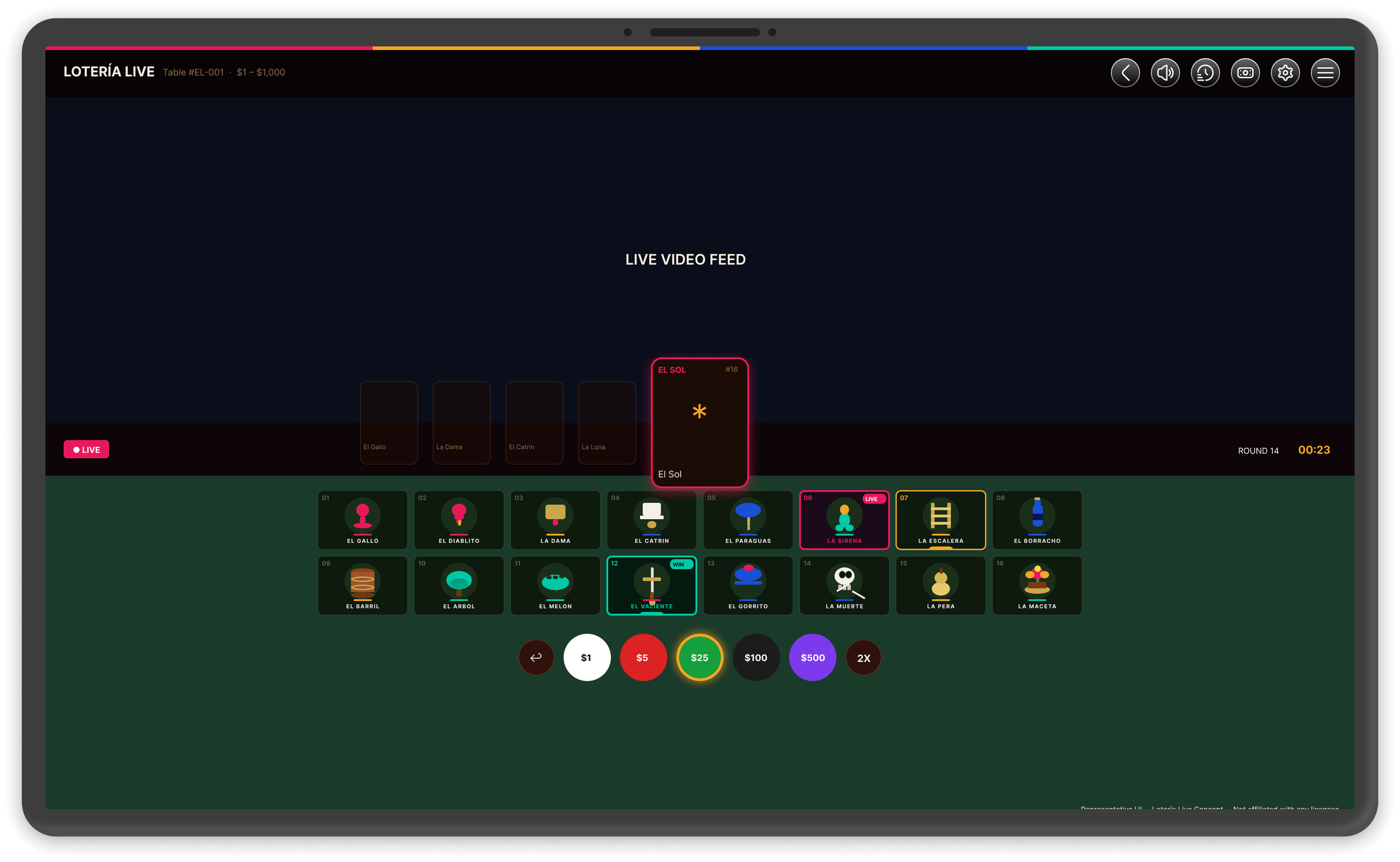
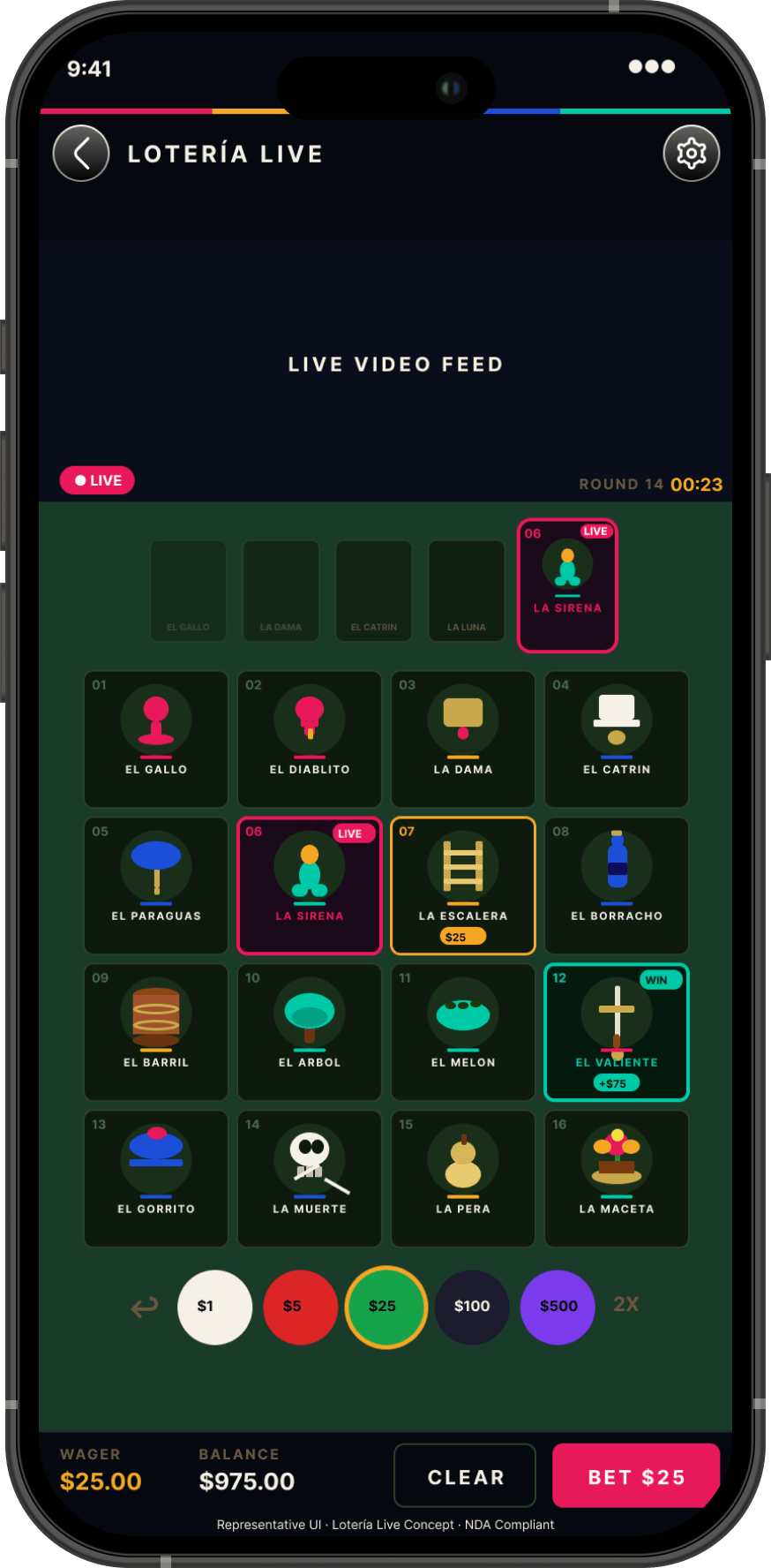
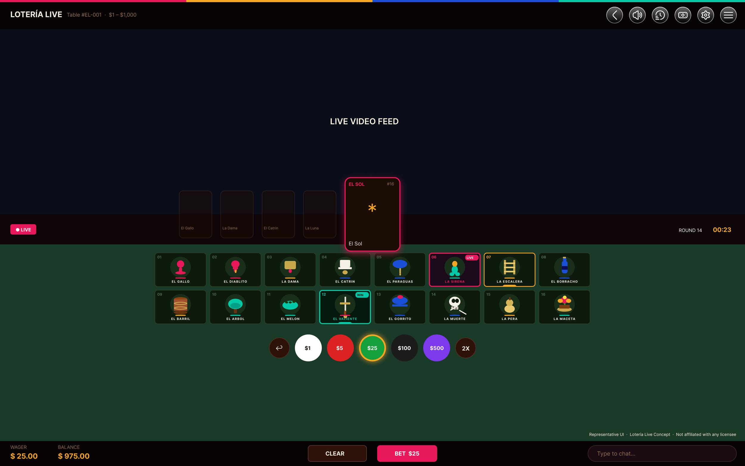
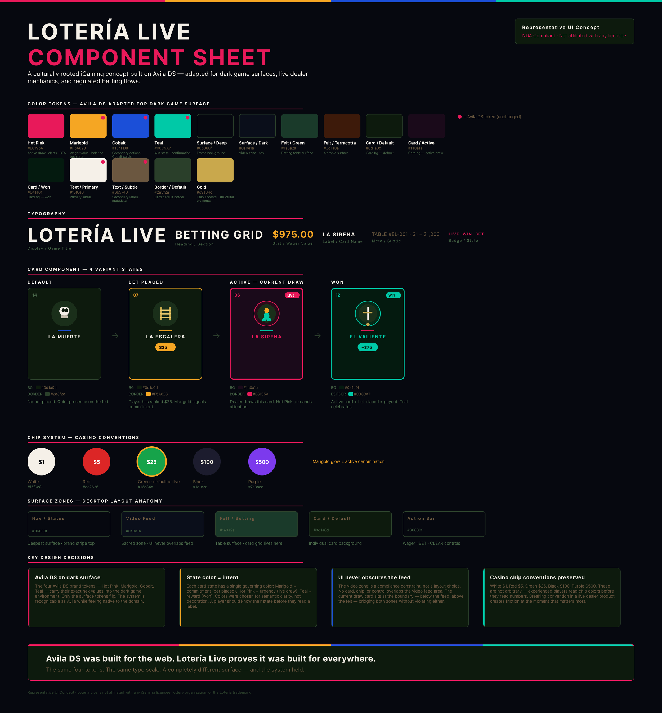
Lotería Live is a live dealer iGaming concept built from scratch: a culturally rooted betting game based on the traditional Mexican game of Lotería, designed on a purpose-built dark surface design system adapted from Avila DS. Same four brand tokens — Hot Pink, Marigold, Cobalt, Teal — adapted to a game environment with compliance-aware UI zones, casino chip conventions, and full card state logic.
The same decisions that governed the Sands engagement — UI placement as compliance, motion earning its place, surface tokens serving meaning not decoration — are visible in every frame.
The desktop frame shows the complete system in one view: the sacred video feed zone that no UI element crosses, the Avila DS rainbow stripe anchoring the nav, the 4×4 betting grid with live card states, and the chip row using casino-standard denomination colors that experienced players read before they read numbers.
The mobile frame collapses the same system to a single column — video feed, current draw card bridging the felt transition, full card grid, chip row, action bar. Two surfaces. One token architecture. The same constraint the Sands engagement required.
In Closing
Most design problems are screen problems. This one was a systems problem disguised as a screen problem.
The screens were the output. The decisions — about compliance, about motion, about when to slow down and when to ship — were the work. A platform that five teams can build from consistently is worth more than any individual screen that comes out of it.
That's what 16 weeks of regulated platform design actually looks like from the inside.