MyHealth App
Designing for clarity, control, and trust in healthcare billing - a product category that has failed patients for decades.
Project Details
Healthcare billing is one of the most confusing experiences in modern life. Patients receive bills with unfamiliar codes, can't tell what insurance covers, and have no clear path when a claim is denied. The tools that exist to help (provider portals, insurer apps) tend to make things worse by burying critical functionality deep in menus and presenting financial information in language designed for administrators, not people.
This product was designed to flip that model. Clarity first. Critical actions surfaced. Plain language throughout.
Role: Product Designer Industry: Healthcare Tech Scope: Mobile UX · Information Architecture · Claims Submission · Patient-Facing Billing
Industry: Healthcare Tech
Scope: Mobile UX · Information Architecture · Claims Submission · Patient-Facing Billing
The Problem
Healthcare billing fails patients in predictable, fixable ways.
The core failure isn't technical, it's a design philosophy that treats billing as an administrative back-office function rather than a patient-facing experience. The result is always the same:
Users who don't understand what they owe, don't know why a claim was denied, and can't find the tools to do anything about it.
Three failure patterns showed up consistently across existing products:
Billing information fragmented across multiple screens with no unified view
Claims submission hidden so deep in settings that most users never find it
Status updates written in insurance jargon that requires a professional to interpret.
These aren't edge cases. They're the default experience for most patients navigating the healthcare system today.
Research & Discovery
Validating assumptions with real frustration points.
Research drew from competitive audits of five existing patient billing apps, user interviews, and usability analysis of common failure patterns across provider portals and insurer apps.
Discovery confirmed what the problem space suggested and added specificity that shaped every design decision that followed.
Users don't read insurance codes. They want plain language that tells them what happened and what it means for them. Claims submission is abandoned not because users don't want to submit claims, but because they can't find the tool. A single unified dashboard is the expectation. Jumping between tabs and menus to piece together a financial picture is a failure state, not a feature. And users want to know when something will be resolved. Timelines and expected outcomes are trust signals, not optional details.
This feedback didn't just inform the design, it became the design criteria.
The Design Decisions
What the research demanded and how the product responded.
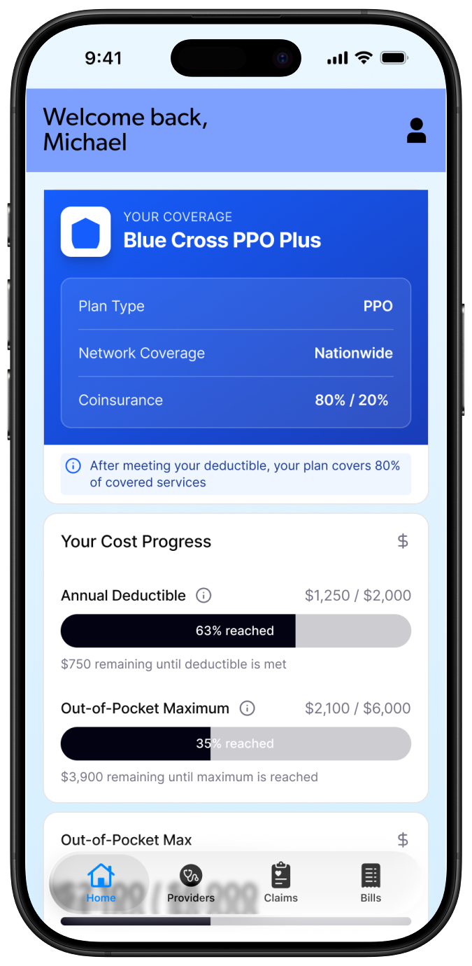
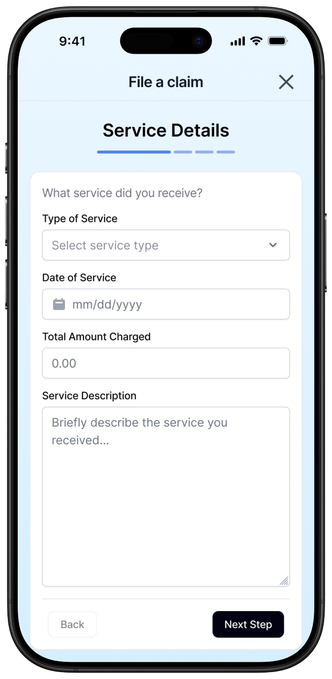
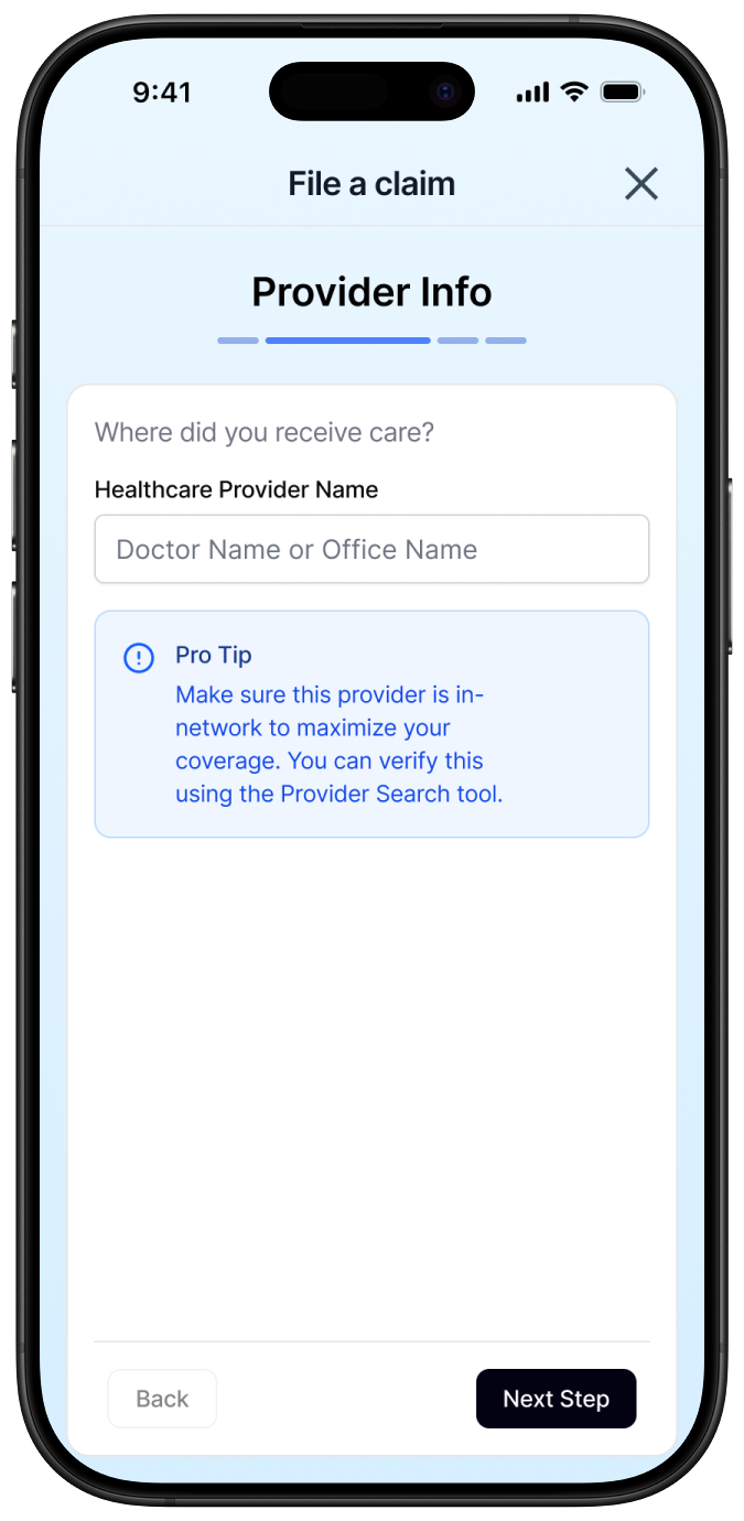
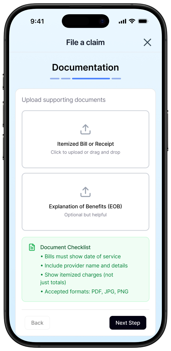
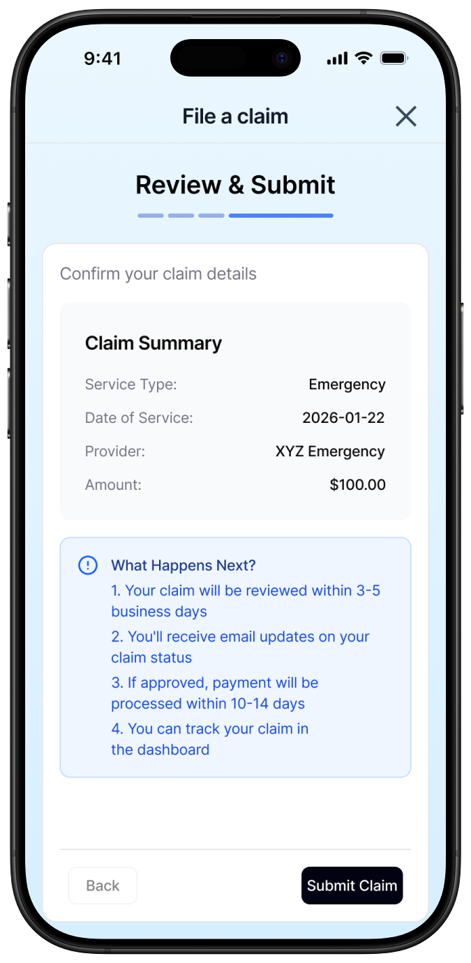
Surface claims submission at the entry point, not buried in settings
The single highest-impact decision in this product was placing claims submission visibly on the main dashboard with a persistent CTA. In every existing product audited, this feature was hidden. Making it visible from the first screen isn't a UX flourish, it's the difference between a patient who gets reimbursed and one who gives up.
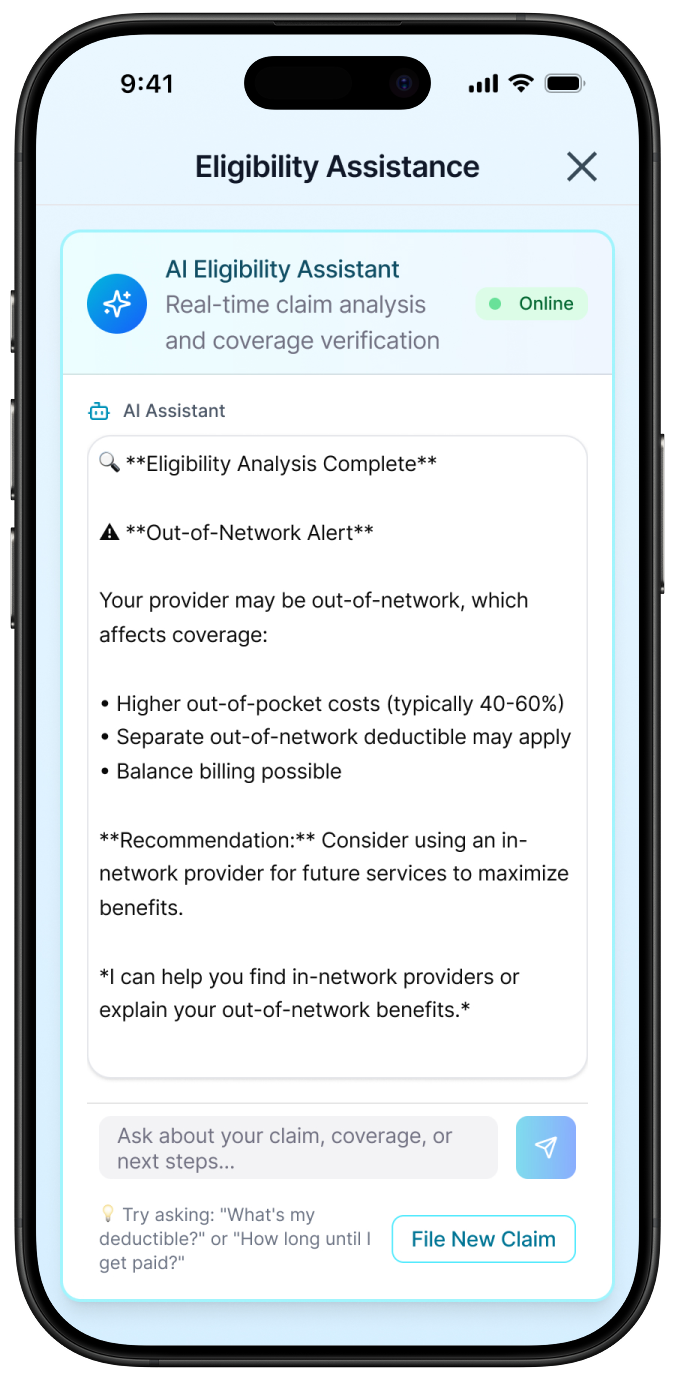
Replace insurance codes with plain language explanations
Every bill detail page shows provider charges, insurance adjustments, and remaining balance in language a patient can understand. Expandable line items and inline tooltips let users drill into the detail they want without being overwhelmed by what they don't.
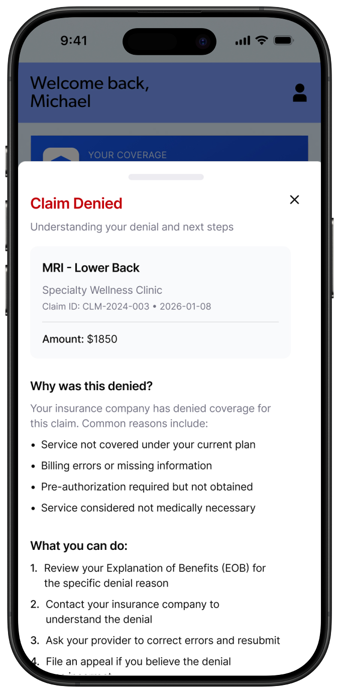
Make claim status actionable, not just informational
A claim status of "Denied" is useless without context. Every claims status view shows the reason for denial in plain language, a timeline of activity, and suggested next steps: appeal, contact provider, attach additional documentation. This turns an opaque administrative process into a pathway a patient can actually follow.
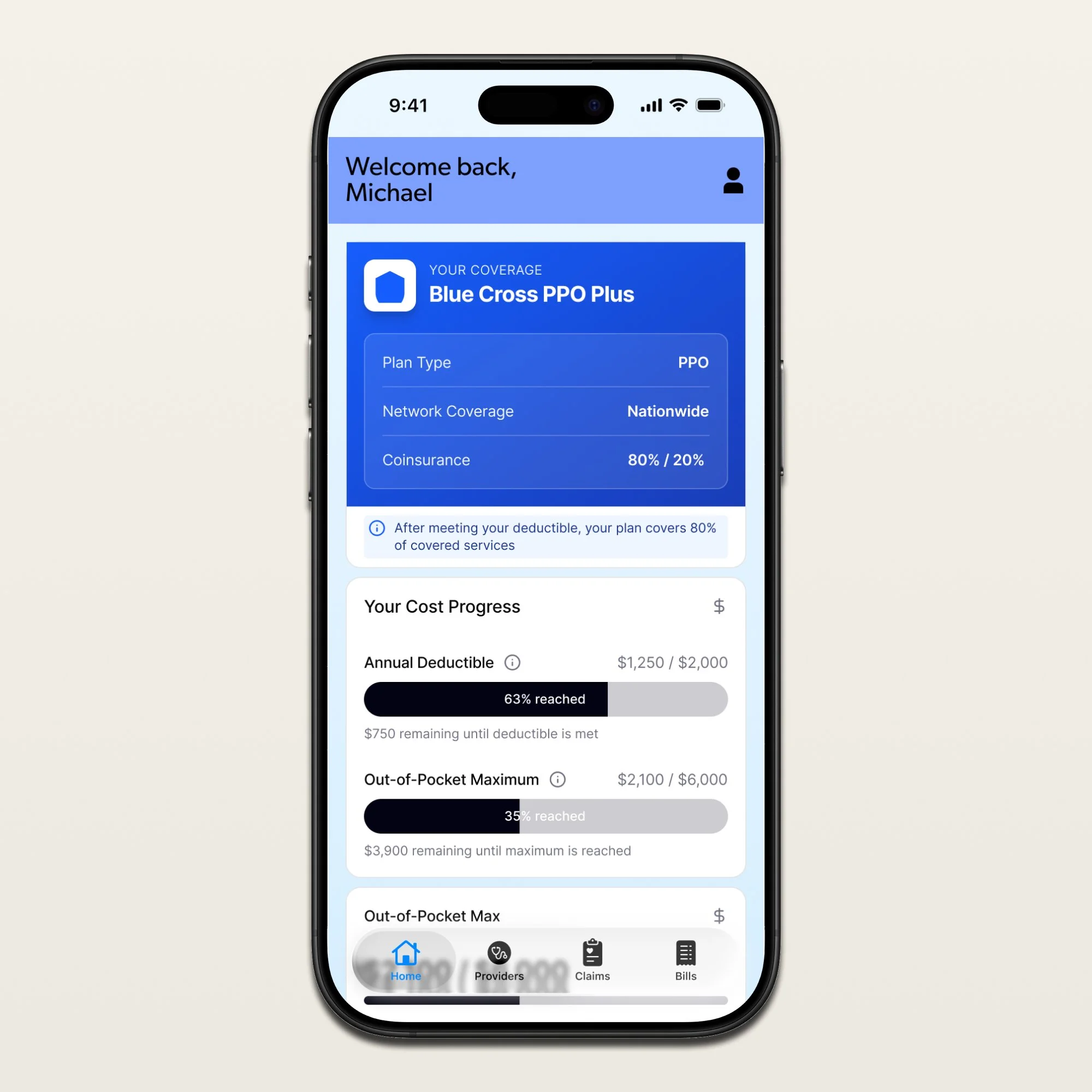
Design the dashboard around what matters right now
Outstanding balance, upcoming due dates, recent bills, recent claims, and alerts requiring action, all visible at a glance. The dashboard isn't a summary of the app's features. It's a summary of the patient's current financial situation with their healthcare provider.
In Closing
Healthcare billing doesn't have to be a system patients endure. It can be one they navigate with confidence.
This product isn't a bill viewer. It's a billing partner, one that treats the patient as someone who deserves clarity, not someone who should just accept confusion.
This prototype was built using Figma Make as part of an AI-native design workflow, click to experience the full interaction flow.