Pediatric Care Operations Hub Case Study
Four systems. One queue. Compliance designed in — not bolted on.
Project Details
Role: Staff Product Designer — Regulated Systems
Platforms: Web, Pediatric care operations platform
Industry: Healthcare Technology
Scope: Feature Design · UX Strategy · Design Systems · HIPAA-Aligned Interaction Patterns · AI-Assisted Production
Status: Concept, not affiliated with any healthcare provider or EHR vendor
The Problem
Pediatric care offices run on four systems that don't talk to each other.
The EHR. A claims system. A vaccine registry. A shared spreadsheet holding everything the other three don't cover.
Staff stitch it together by hand, every single day. And things fall through. A pre-auth nobody picks up. A vaccine follow-up that ages out. A claim rejection with no name on it.
| Surface | What It Covers | What It Misses |
|---|---|---|
| EHR | Clinical records, visit notes | Operational risk, ownership, aging |
| Claims system | Billing status, rejections | Clinical context, patient identity |
| Vaccine registry | Compliance by patient | Workflow assignment, escalation |
| Shared spreadsheet | Everything else | Access control, audit trail, reliability |
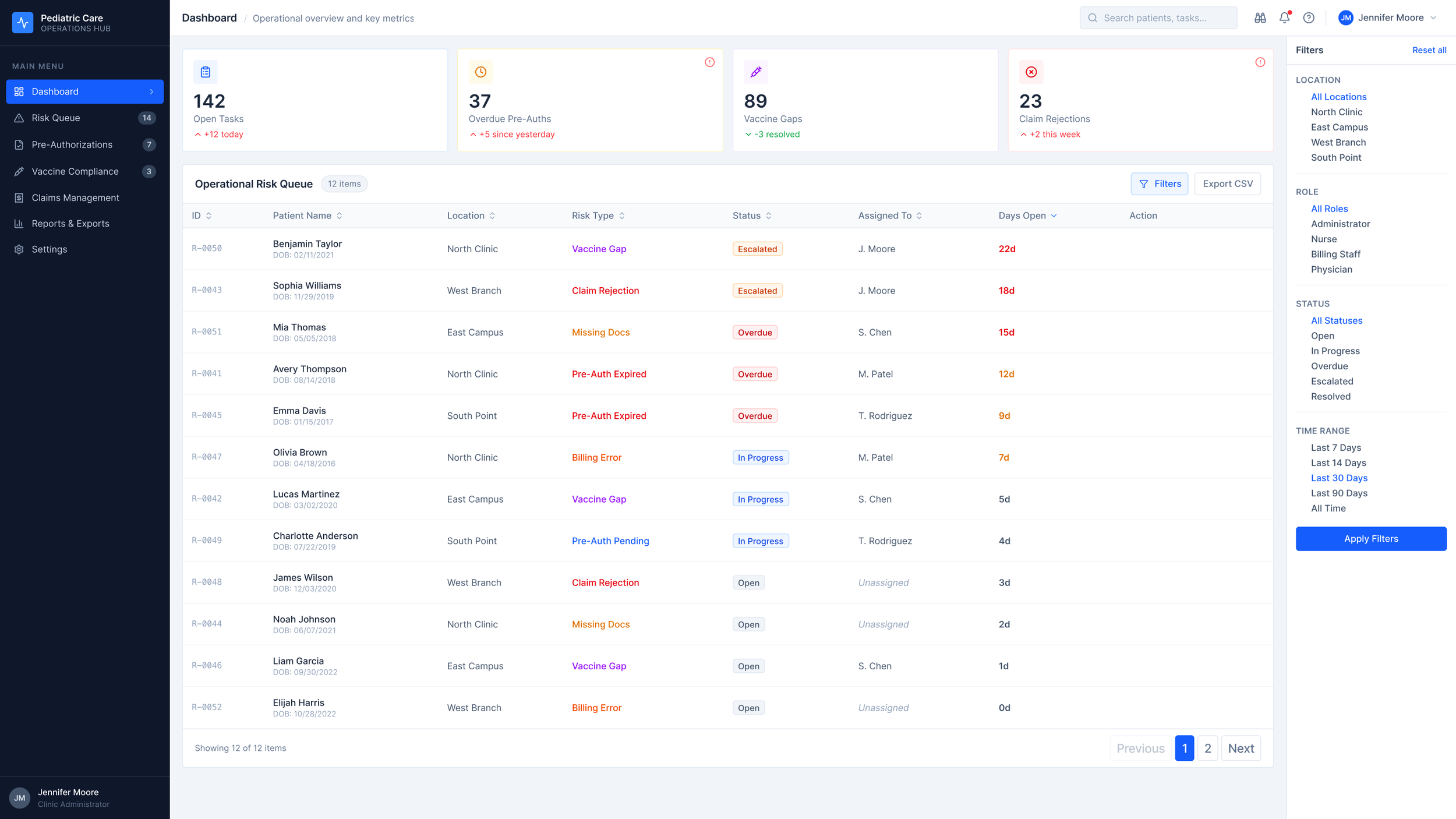
The information exists. It's scattered across four systems, reconciled by hand every morning, and nobody's dashboard shows the whole picture at once.
The cost isn't abstract. It shows up in a Days Open column: 22 days, 18 days, 15 days on the top three unassigned items. That's delayed care and leaking revenue, made visible in numbers.
The Research
I talked to pediatric office managers, billing leads, and clinical coordinators. Three patterns kept coming up.
No source of truth. Staff rebuild the same picture every morning from four tabs. The reconciliation isn't a one-time setup — it's daily, manual, and load-bearing.
Implied ownership. Risk items float between roles until someone picks them up. The system doesn't assign ownership. It assumes it. Sometimes that assumption is wrong and nobody notices until the item is three weeks old.
Missing role context. Clinical staff see billing noise. Billing sees clinical noise. Everyone filters in their head, which means everyone filters differently, which means things get missed at the edges of two people's mental models.
| Pattern | What It Looks Like | What It Means for Design |
|---|---|---|
| No source of truth | Four tabs, reconciled by hand | One queue. Computed live. |
| Implied ownership | "I thought you had it" | Name and role on every record |
| Missing role context | Everyone sees everyone's work | Role-based filtering, not hiding |
The signals are already in the data. What's missing is a surface that assembles them, prioritizes them, and makes ownership explicit.
Design Decisions
The four KPIs — and the one I cut
I chose four metrics. Each one maps directly to a patient outcome or a dollar.
Open Tasks — how much is in flight.
Overdue Authorizations — delayed procedures, delayed care.
Vaccine Non-Compliance — regulatory and clinical risk.
Claim Rejections (30d) — revenue leaking out.
I considered a fifth: Missing Documentation. I cut it.
Missing docs is a cause of the other four, not a standalone signal. Adding it would have doubled the cognitive work without adding actionable information. The dashboard's job is to surface what needs a decision, not everything that's technically true.
Table, not kanban
I looked at kanban. I looked at cards. I picked a sortable table.
| Pattern | Why I Considered It | Why I Cut It |
|---|---|---|
| Kanban board | Visual clarity | Hides aging. Hides volume. Doesn't scale past 20 items. |
| Card grid | Dense, modern feel | Can't sort. Can't filter. Reads like a catalog, not a queue. |
| Sortable table | Fast scan. Multi-column sort. Scales to any volume. | Picked. |
A queue is a scanning task. Kanban and cards are browsing tasks. I kept picking the wrong pattern until I stopped asking "what looks good" and started asking "what is this person actually doing."
Status tokens
Five states. Each one with a specific job.
Escalated — orange — leadership needs to see this.
Overdue — red — SLA breached.
In Progress — blue — owned and active.
Open — neutral — waiting for a name.
Resolved — teal — closed.
Color is never the only signal. Every state carries a label and an icon. That's a WCAG requirement, but it's also just the right call — a colorblind clinician shouldn't have to ask what a badge means.
The Filter Panel — Two Arguments, One Component
The filter panel controls what a coordinator sees. That's the UX argument: role-appropriate views reduce noise and speed up triage.
It also enforces HIPAA's Minimum Necessary standard at the UI layer — showing staff only the information their role requires access to. That's the compliance argument.
Same component. Two arguments. Both true. The best compliance work doesn't add friction — it removes the wrong information from the wrong person's view.
The System
Three components carry most of the weight across the product.
Status badge
Named tokens for each state: status/escalated, status/overdue, status/in-progress, status/open, status/resolved. WCAG AA contrast on every one. Color is locked to the state — no overrides. That's intentional.
The badge is the single most reused component in the system. If anyone can tune its color, visual consistency is gone inside a sprint and the semantic meaning of each state becomes ambiguous. Locked tokens are a systems decision disguised as a design constraint.
Risk Type Taxonomy
Six risk types — not UI labels, but a controlled vocabulary that lives in the data model.
| Risk Type | Clinical Scope | Default Owner |
|---|---|---|
| Pre-Authorization | Procedure approval | Billing Coordinator |
| Vaccine Compliance | Immunization follow-up | Clinical Coordinator |
| Claim Rejection | Payer denial | Billing Lead |
| Documentation Gap | Chart completeness | Clinical Coordinator |
| Referral Handoff | External specialist | Case Manager |
| Escalation | Any type past threshold | Office Manager |
Get this taxonomy right and it's invisible. Get it wrong and it poisons every report, every filter, every downstream chart six months later. The hour spent here is paid back every time someone runs a query.
Days Open Threshold
| Days Open | Visual Treatment | What It Means |
|---|---|---|
| 0–6 | Neutral | Inside the expected cycle |
| 7–13 | Amber | Nearing breach |
| 14+ | Red | Breached |
One detail that matters more than it looks: the clock starts at item creation, not assignment.
If it starts at assignment, a manager can reset a problem by reassigning it. That's not visibility — that's laundering aging. The whole point of the system is to make elapsed time inescapable.
Interaction Design
Two interactions carry most of the product's operational weight.
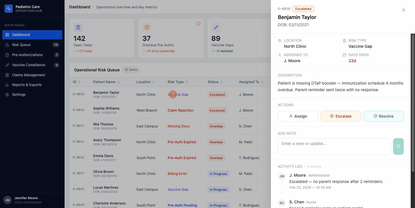
Risk Detail Drawer
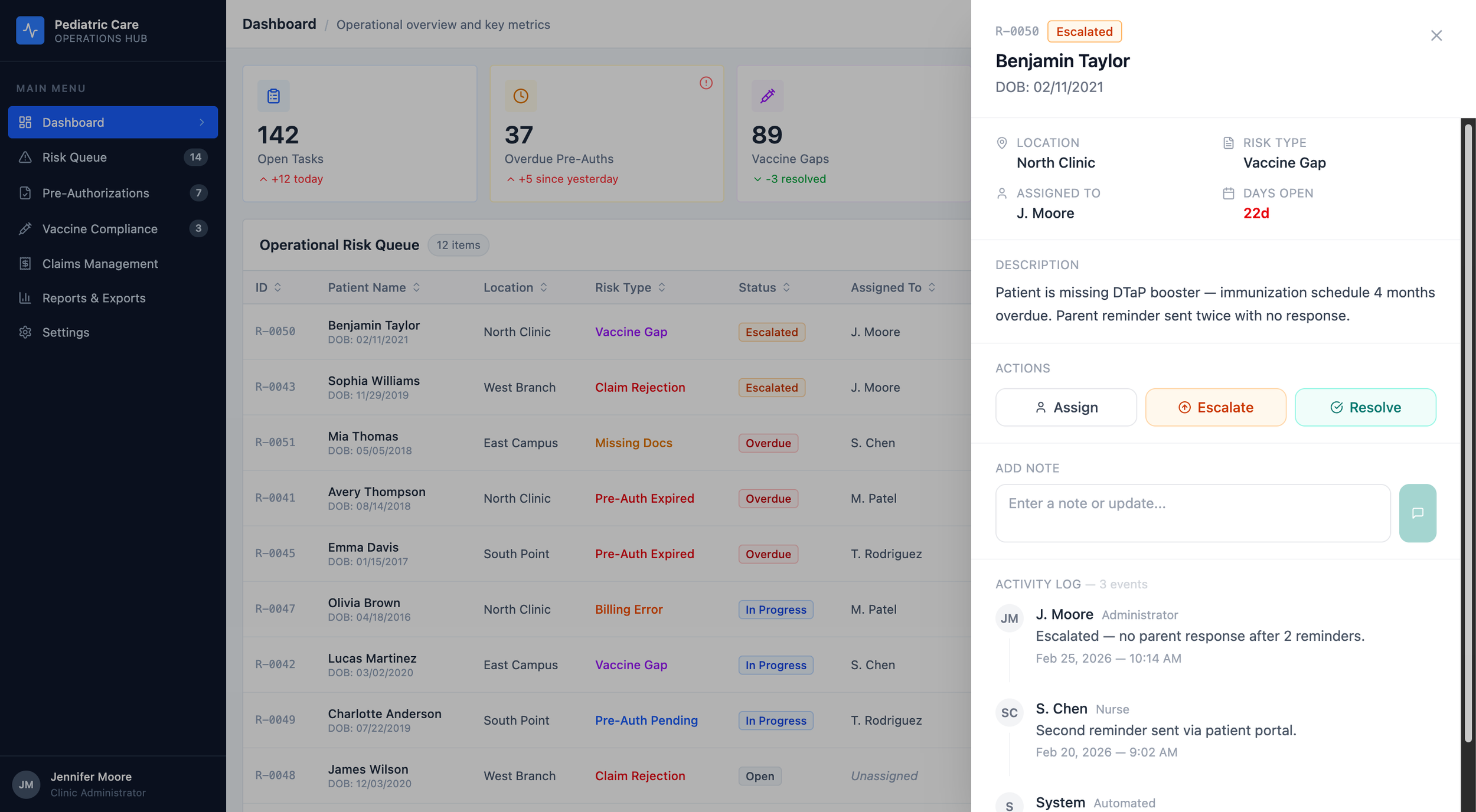
One drawer. Two surfaces. Shared state.
Click any row , on the Dashboard or the Risk Queue, and a drawer slides in from the right.
Patient header at the top. Meta grid. Description. Action buttons. A place to drop a note. The full activity log.
The activity log sits inside the drawer, not in a separate tab. In a regulated environment, the audit trail and the decision must happen in the same surface.
Here's the systems part. The drawer is one component. It's used on two different pages. It's wired to shared state.
Hit Resolve on the Dashboard. The badge updates in the drawer. It updates in the row behind the drawer. Navigate to the Risk Queue two seconds later and the same item is already showing Resolved.
I thought about a few other patterns before I landed here.
| Pattern | Why I Thought About It | Why I Cut It |
|---|---|---|
| Full-page detail route | Room for everything | Kills the queue rhythm. You lose your place on every click. |
| Inline row expansion | Never leaves the list | Pushes every row below it down the page. Audit logs make it ugly fast. |
| Right-side drawer | Keeps the list visible. Holds rich content. One-click dismiss. | Picked. |
You can open the drawer yourself in the live prototype. Click any row on the Dashboard.
The Session Timeout
HIPAA §164.312(a)(2)(iii) says covered entities have to terminate sessions after inactivity. Most healthcare software handles this like a trapdoor — a surprise modal at the end of a countdown, or worse, a silent logout that dumps you at the login screen.
I didn't want a trapdoor. I wanted a sequence.
Compliance tells you what has to happen. It doesn't tell you how.
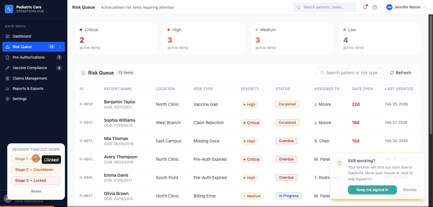
Three stages. Each one has a different job.
Stage 1 — the nudge. A toast slides in from the bottom-right. Amber clock icon. "Still working?" A button that says "Keep me signed in." A progress bar shrinking to zero. The toast doesn't block anything. If you're finishing a note or closing a drawer, keep going — the toast waits.
Stage 2 — the countdown. A modal with a backdrop blur. A circular timer that goes green to amber to red as it counts down. Two options : Continue session or Sign out. The HIPAA citation sits at the bottom of the modal in small type. I wanted a regulator to be able to look at this screen and recognize it.
Stage 3 — the lock. Full screen. Dark navy, same as the product's sidebar. Your avatar. A password field. A line that says the session ended due to inactivity, so you don't wonder if something crashed. A footer that reminds you this device shows PHI. When you re-authenticate, you go back to the exact page you left.
| Stage | Pattern | Experience | What It Does for Compliance |
|---|---|---|---|
| 1 | Bottom-right toast | Non-blocking nudge | Detects inactivity, warns the user |
| 2 | Countdown modal | Acknowledgement required | Explicit intent before termination |
| 3 | Full-screen lock | Session ended, context preserved | Terminates session, locks access |
Stage 3 is not a login page. It's a lock screen. That's a distinction that sounds small and isn't.
A login page tells you you left. A lock screen tells you you're still here, and that you'll be here when you come back. In a pediatric office, where a clinician might step away to handle a crying toddler and come back ninety seconds later, that difference matters.
The Prototype
Seven screens. Fully interactive.
Dashboard. Risk Queue. Pre-Authorizations. Vaccine Compliance. Claims Management. Reports & Exports. A global session timeout overlay that can be toggled on for demos and stays hidden for clean screenshots.
The drawer updates live state. The timeout cycles through all three stages on demand. Nothing in this case study is aspirational — everything here is in the running build.
In Closing
I've spent years designing for regulated industries. Fintech. Gaming compliance. B2B operations platforms.
Healthcare isn't a new domain. It's a new set of citations.
The patterns are the same: compliance as a design constraint with a citation attached, audit trails as first-class UI elements, role-based access as a UX principle that serves the user and the regulator simultaneously. I've been building that way for a decade. This project is what it looks like applied to a pediatric operations problem.
The specifics change. The thinking does not.
Project Notes
This is a concept project. The Pediatric Care Operations Hub isn't a real product and isn't affiliated with any healthcare provider, EHR vendor, or clearinghouse. Patient names, record IDs, and operational data in the prototype are synthetic, constructed to be realistic, not exported from a real system. Compliance references to HIPAA are directional, not legal guidance.
This project is a design artifact. Not a clinical system.
AI tools used:
Claude (Anthropic) for case study structuring, writing, and component code drafting
Figma Make for UI generation and live prototype publication
Full transparency statement available on request
References
HIPAA Security Rule, 45 CFR §164.312.
Technical Safeguards HIPAA Privacy Rule, 45 CFR §164.502(b).
Minimum Necessary Standard WCAG 2.1 Level AA.
Color Contrast Guidelines Office of the National Coordinator for Health IT — healthit.gov