The Athletic:
From Second Screen to First Screen
Sports media has a presence problem. The Athletic has the best writing in the room and the product to prove it — on every screen a fan uses during a game.
Project Details
Role: Staff Product Designer — Platform Strategy
Platforms: iOS mobile, Amazon Fire TV / Prime Video
Industry: Sports Media
Scope: Product Strategy · Feature Design · Cross-Platform Systems · Editorial UX · AI-Assisted Prototyping
Status: Concept, not affiliated with The Athletic, The New York Times, or Amazon
The Problem
Sports fans don't watch games on one screen anymore. They watch on two.
The TV has the game. The phone has the reactions: Twitter for the takes, Reddit for the deep cuts, the group chat for the people they actually know. And somewhere in a tab nobody's opened yet, The Athletic, the smartest writing in the room, waiting to be read after it's already too late to matter.
That's not a content problem. The Athletic has the best beat reporters in the business. It's a presence problem. The subscription is built for reading about the game. The fan's attention is on watching the game. That gap is the product opportunity.
| Surface | Where Fans Are | Where The Athletic Is |
|---|---|---|
| TV broadcast | Watching the game | Not present |
| Live second-screen | Twitter, Reddit, group chat | One tab they haven't opened |
| Post-game | Group chat, highlights apps | Morning column, hours later |
| Between games | Podcasts, YouTube | App launched during commutes |
The Athletic's subscribers already pay for the best sports writing in the business. The product just isn't where they are during a game.
The Opportunity
Two things are true right now that weren't true eighteen months ago.
Amazon paid eleven billion dollars for NBA rights. The Athletic sits adjacent to Prime Video inside the same content ecosystem. A native Athletic app on Fire TV isn't a speculative product pitch, it's the obvious next move that hasn't been drawn up yet.
The editorial product is also more watchable than it's ever been. The Athletic's podcast network is the largest in sports media. Beat writers have become on-camera personalities. The raw materials for a video-forward product are already there.
The question isn't "how do we put The Athletic on TV." The question is what The Athletic becomes when it's the thing you're watching, instead of, or alongside, the broadcast.
The question isn't "how do we put The Athletic on TV." The question is what The Athletic becomes when it's the thing you're watching instead of or alongside the broadcast.
This concept answers that question across two prototypes, two platforms, and eight screens designed to work as one product.
Design Decisions
One canonical game state.
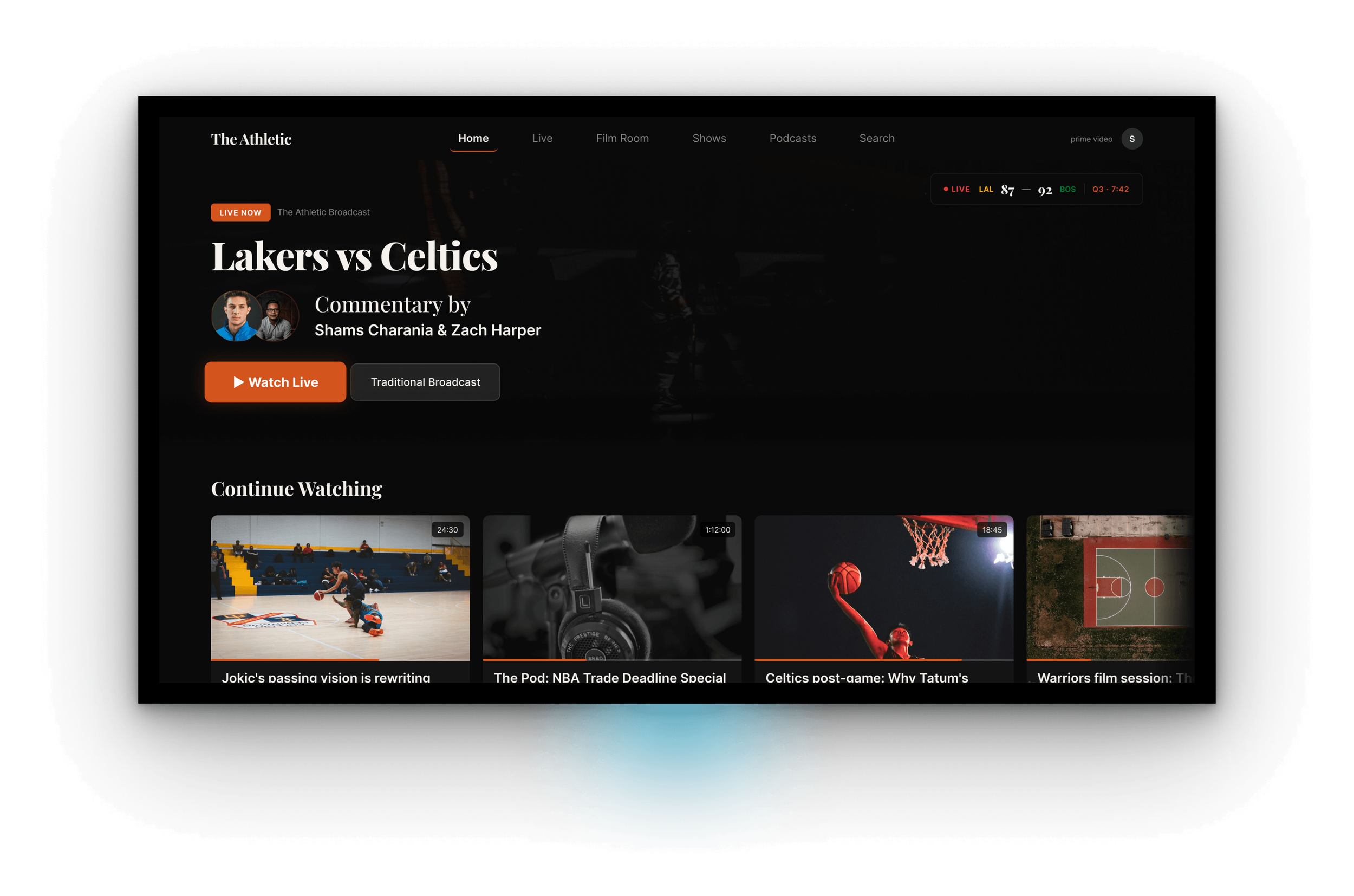
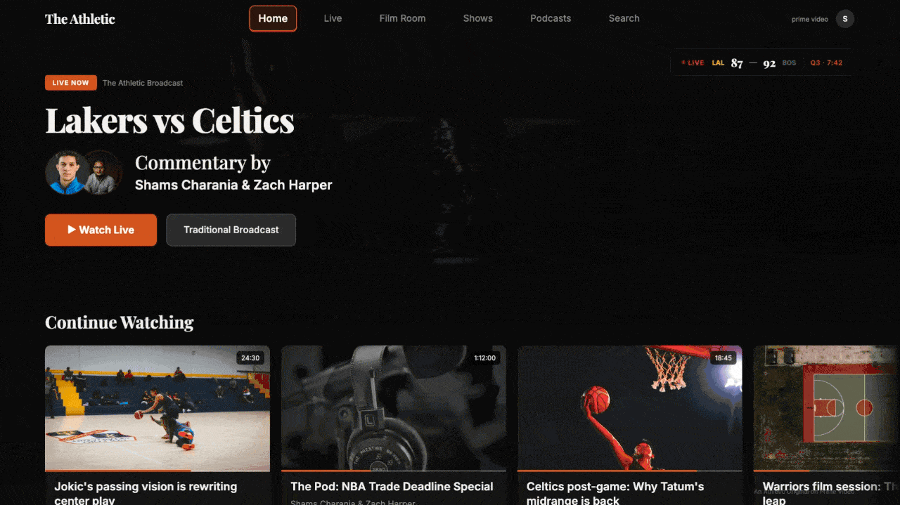
Every screen across both prototypes references the same matchup: Lakers vs. Celtics, third quarter, 7:42 remaining, Celtics up 92–87. The Post-Game Film Session shows the same game's final score. The writers carry the same beats and byline treatments across every surface.
This isn't craft-for-craft's-sake. It's a proof of concept. A portfolio of eight disconnected screens proves you can design eight screens. Eight screens sharing one game state, one writer identity system, and one time signature proves you were designing a platform.
Motion as editorial tone, not decoration.
Loading transitions between major TV sections aren't utility screens, they're branded editorial moments. Near-black backdrop. The Athletic wordmark in serif. A small-caps section label. A subtle animated element that signals what kind of content is about to play.
In premium streaming, the transition is where the service announces itself. That decision isn't in the component library, it's in the point of view.
Writers Over Logos
Every screen across both prototypes prioritizes the writer over the team. Portraits are large. Bylines are readable from across a room. Beat labels carry more visual weight than score graphics.
I considered treating this as a personalization toggle. I cut it.
| Pattern | Why I Considered It | Why I Cut It |
|---|---|---|
| Team-first UI (logos, colors dominant) | Matches broadcast conventions | Makes The Athletic look like every other scores app |
| Personalized by favorite team | Feels "smart," drives engagement | Hides the editorial product behind the commodity product |
| Writer-first across the board | Surfaces the actual subscription value | Picked. |
The Athletic's defensible moat is the journalist, not the matchup. The design has to reflect that everywhere.
The System
Three patterns carry most of the weight across both prototypes.
Cross-Platform Editorial Voice
Same typography scale, Tiempos Headline across mobile and TV. Same burnt orange accent (#D4541E). Same writer portrait treatment, 64pt on mobile, 96pt on TV. Same timestamp syntax, "Q3 · 7:42", so editorial context carries the same time signature as the broadcast on every surface.
Mobile
- Serif headlines Tiempos Headline
- Accent color Burnt orange #D4541E
- Writer portrait 64pt circular
- Timestamp treatment "Q3 · 7:42"
TV
- Serif headlines Tiempos Headline
- Accent color Burnt orange #D4541E
- Writer portrait 96pt circular
- Timestamp treatment "Q3 · 7:42"
A fan moving between their phone and their TV should recognize the product before they read a word.
Focus States for the Medium
Mobile is touch. TV is D-pad. The same interactive affordances, tuned to two completely different physics.
On mobile: 44pt tap targets, haptic feedback. On TV: every focusable element scales up 110%, picks up a 2pt accent glow, adds elevation shadow, a remote's focus ring made visible from ten feet away.
Same interaction model, two rendering layers. That's what cross-platform systems design actually looks like in practice, not in a principle document.
Editorial Chrome as Product
The transition animations — the drawing line, the spotlight pulse, the audio waveform — aren't motion polish applied at the end. They're the product's voice made visible at the exact moment a viewer crosses from one context into another. They were designed first, not last.
Interaction Design
Two interactions do the heaviest lifting across the TV prototype.
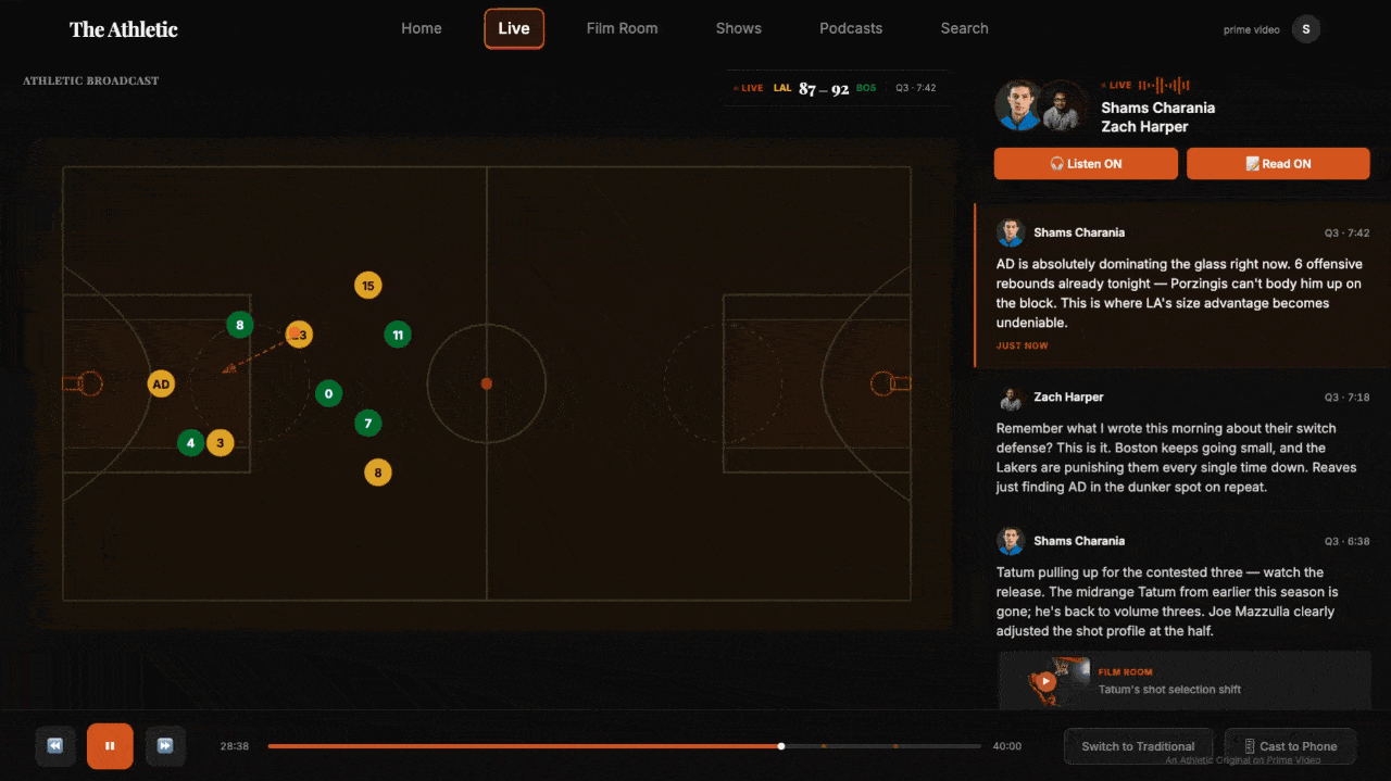
The Athletic Broadcast — Commentary Rail
The live game plays on the left side of the screen. The writers sit on the right, in a vertically scrolling rail of real-time takes, each timestamped to the game clock. Some takes have inline "Film Room" chips that open an annotated breakdown of the play being discussed.
It's Manningcast, but executed with editorial depth instead of celebrity cameos. The writer's voice replaces the network's, and the journalism has the same time signature as the broadcast.
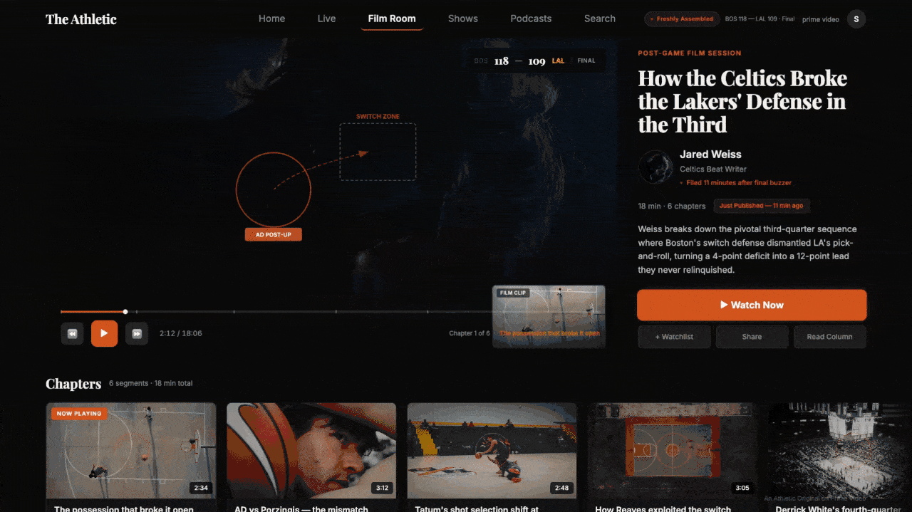
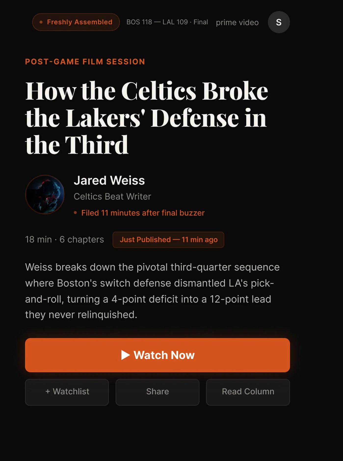
The Post-Game Film Session — Auto-Assembled Show
The final buzzer sounds. Eighteen minutes later, a watchable show exists, headline, byline, annotated chapters, and a "Freshly Assembled · 11 min ago" badge that reinforces what just happened.
This is what a newsroom looks like when its publishing window collapses to zero. The morning column still gets written. But the product already met the fan at the moment the emotion was highest.
The Freshly Assembled indicator is a small visual commitment with large implications. It signals that The Athletic's editorial product isn't catching up to the game — it's assembled and ready the moment the final buzzer sounds.
The Prototype
Eight screens across two platforms. Four on mobile, four on TV. Fully interactive, with scroll behavior, focus states, loading transitions, and a consistent writer identity system running through the whole thing.
Working With Generative Tools
Both prototypes were built in Figma Make across two evenings.
Generative design tools have a consistent failure mode that nobody talks about honestly: you prompt a fix, the model's attention narrows, and something unrelated silently regresses. A nav cluster disappears. A label lands on top of a pull quote. A scroll container looks complete but isn't wired.
Across eight screens I caught and drove through roughly a dozen of these regressions. Some in the moment. Some only by diffing the new output against the previous version.
| Failure Mode | How It Shows Up | How I Handled It |
|---|---|---|
| Silent regression | Fixed element disappears after unrelated prompt | Diff every output against previous version |
| Static-looking scroll | Rail "looks done" but doesn't actually scroll | Test every scroll container before moving on |
| Overflow drift | Nav bar extends past viewport after a fix | Constrain explicitly, re-check after each pass |
| Style drift | Focus states or colors shift between screens | Establish the system on the first screen, reference back |
Generative tools produce screens. Designers produce shipped products. The distinction is everything and it's entirely invisible unless you're the one catching the regressions.
In Closing
Most Staff candidates submit three polished screens of an existing product.
This is a proposal document disguised as a design system, for a moment that's sitting in front of The Athletic right now, whether or not I'm the one who draws it up.
The specifics change. The thinking does not.
Project Notes
This is a concept project. The Athletic Live and The Athletic TV are not real products and aren't affiliated with The Athletic, The New York Times, or Amazon. Writer names are used for illustrative realism and don't imply endorsement. Game data is synthetic.
AI tools used:
Claude (Anthropic) for product strategy, case study structuring, and prompt sequencing
Figma Make for UI generation and live prototype publication
Full transparency statement available on request