Cocoon Cannabis Platform
Nobody handed me a roadmap. Cocoon needed two products built in parallel — a consumer shopping experience and an operator command center — and the only way to know if the decisions were right was to hold both sides in your head at the same time.

Project Details
Cocoon builds self-service kiosks for cannabis dispensaries, enabling faster transactions and reduced staff load. As the retail market evolved, Cocoon needed to expand in two directions simultaneously: outward, into a full omnichannel eCommerce platform for customers, and inward, into a unified web admin system for operators managing their kiosk fleets.
I was brought in to design both — the complete customer-facing digital shopping experience and the backend admin portal that powers it. This is the full-stack story of one platform, seen from both sides.
Role: Product Designer — UX, UI, Interaction Design, Component Library, Research Synthesis, Developer Handoff
Client: AUSA (Audacious)
Platform: Mobile Web (eCommerce) + Desktop/Responsive Web (Admin)
Scope: End-to-end ecosystem design — consumer shopping + operator management
Timeline: June 2020 – April 2021
One Kiosk.
Two Products That Didn't Exist Yet.
When I joined, Cocoon had one product: a physical kiosk on the dispensary floor. It worked. The business was growing. And because of that growth, two entirely new products suddenly needed to exist — a mobile web shopping experience for customers browsing from home, and a web admin portal for operators managing their kiosk fleets across multiple locations.
Neither product existed. There were no established patterns to follow, no design system, no research repository, no prior art inside the company for what either surface should look like or how they should behave. There wasn't even a clear product brief. The scope was "build the thing that comes after the kiosk" — and figuring out what that meant was part of the job.
This is the first role where I was hired as the only designer and given genuine authority over both the problem definition and the solution. That's the thing I didn't fully name at the time, but it's what made it different from everything before it.

Cannabis Retail Had a UX Problem Nobody Was Solving Honestly
Cannabis retail in 2020 had a UX problem nobody was solving honestly.
The category was borrowing from general eCommerce — Shopify templates, checkout flows lifted from food delivery apps — and applying them to a product with fundamentally different constraints. Age verification isn't a modal you dismiss. Regional compliance isn't a footnote in the footer. Potency education isn't optional copy — it's the reason a first-time buyer adds something to their cart instead of leaving.
On the operator side, the problem was just as specific: dispensary teams were managing kiosk fleets through a combination of spreadsheets, phone calls, and on-site technician visits. There was no unified view of cash levels, no remote diagnostics, no way to push a pricing change to thirty machines at once. The operational cost of that gap was invisible until something broke.
My job wasn't to port the kiosk to a new form factor. It was to design products that understood the category well enough to earn the trust of two completely different users — one who had never bought cannabis online before, and one who had never managed hardware at scale before.
Four Calls That Shaped the Whole Platform
Compliance as a Trust Layer, Not a Legal Checkbox
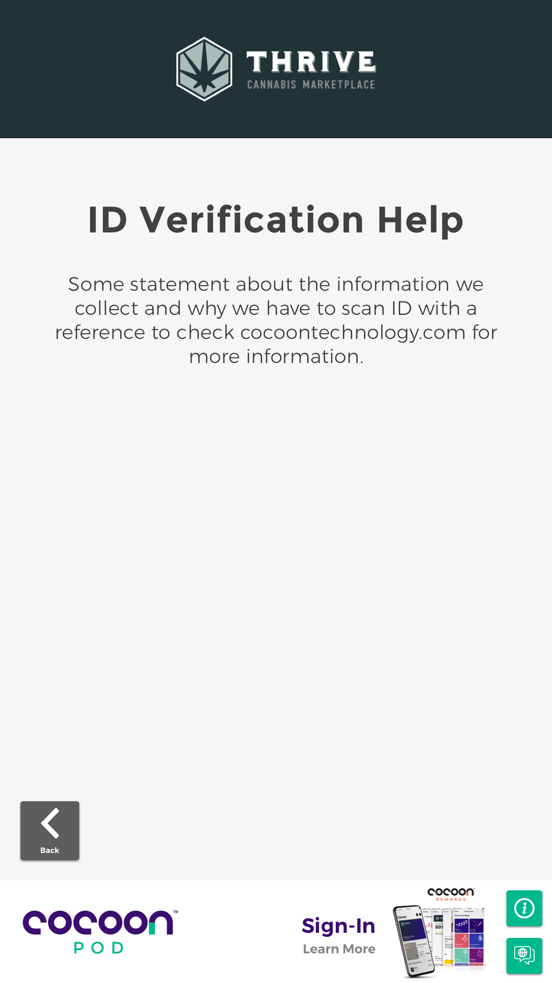
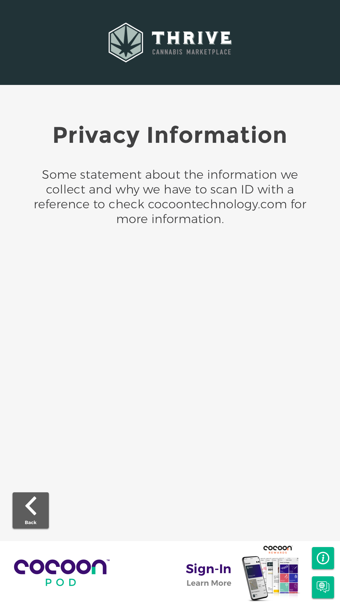
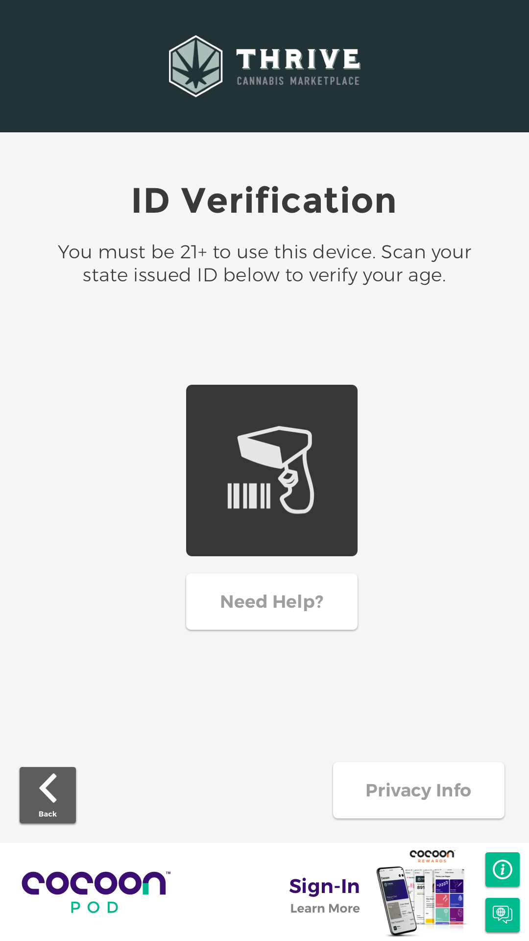
The ID verification and privacy flows were the first thing any new user touched on the kiosk. The industry default was to minimize them as friction — get through it fast, get to the product. I designed them as trust builders. Plain-language copy, clear privacy disclosure, a help screen for anyone who didn't understand why their ID was being scanned. Compliance that feels like the product knowing what it's doing, not apologizing for the rules.
Potency Education as a Conversion Driver
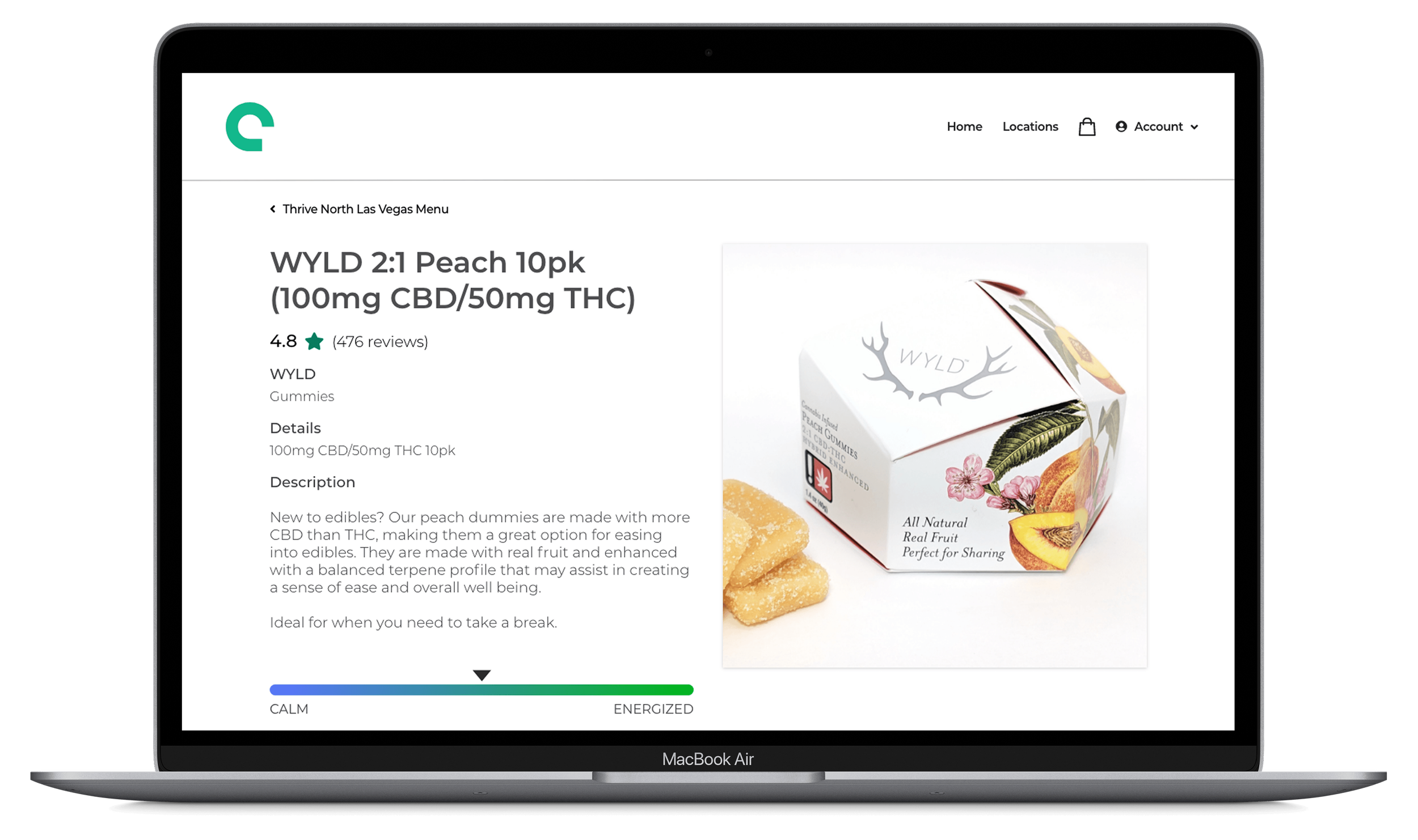
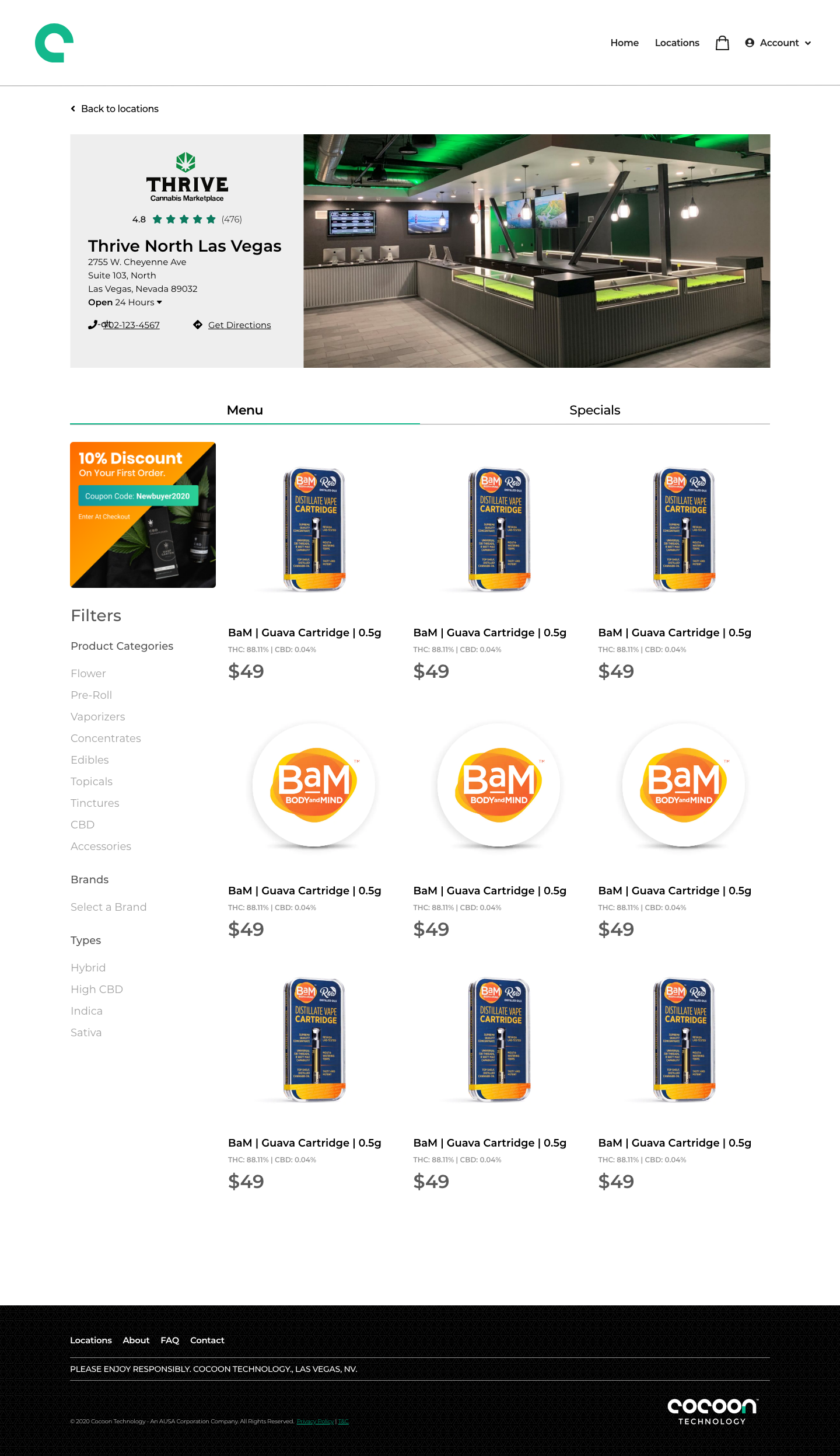
First-time cannabis buyers don't know what 88% THC means. If the product detail page doesn't explain it, they leave and buy nothing. I designed THC/CBD percentages, effects profiles, terpene breakdowns, and strain classifications as primary content — not spec sheet data buried below the fold. The PDP had to do the work a budtender does on the dispensary floor.
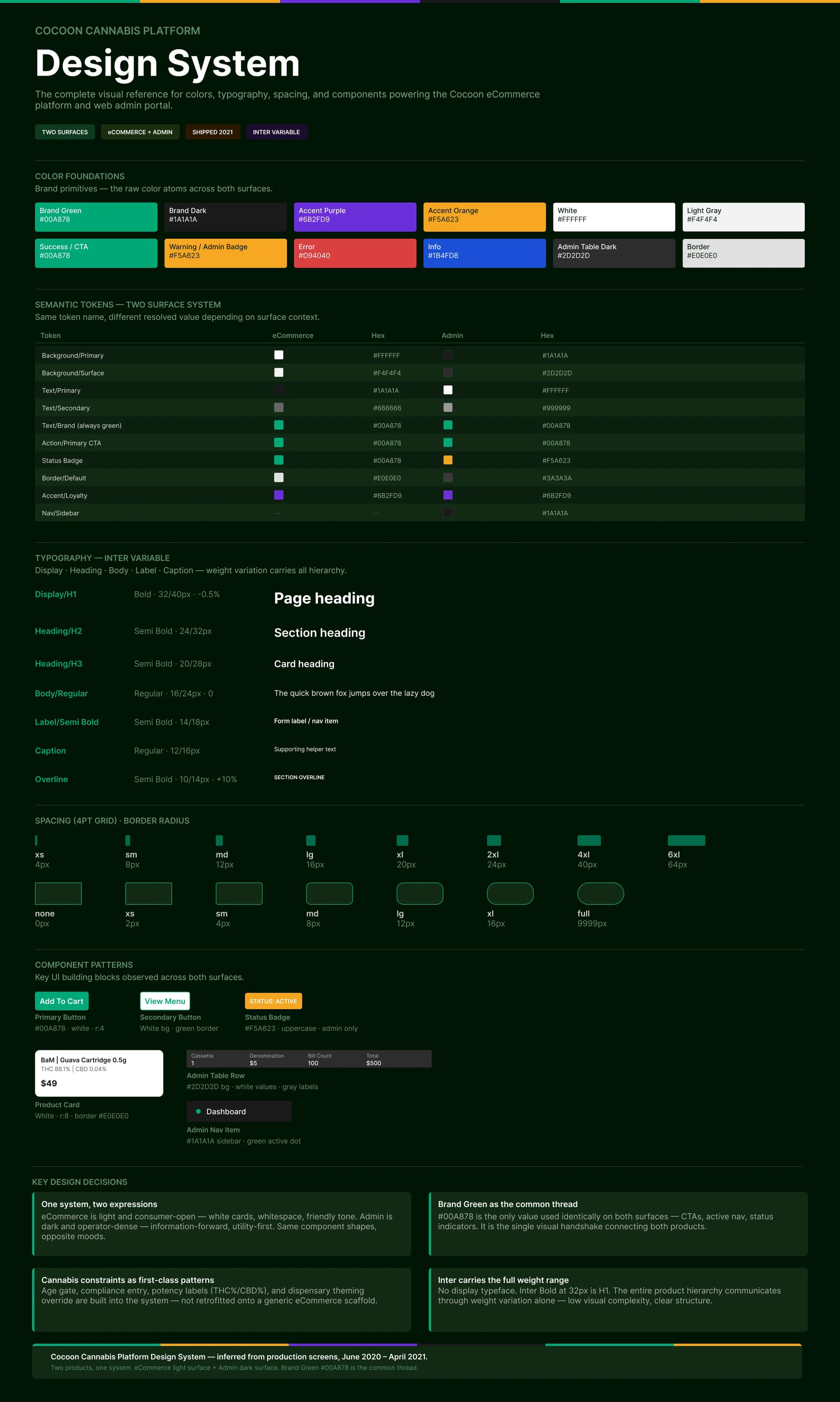
One Component System, Two Completely Different Users
Consumer surface: speed, simplicity, visual warmth.
Admin surface: density, data hierarchy, operational clarity.
The temptation was to design them separately. The right call was shared tokens, shared spacing, shared form elements — with specialization only where context actually demanded it. That decision saved handoff time, reduced engineering complexity, and kept both products coherent without making either feel like the wrong tool.
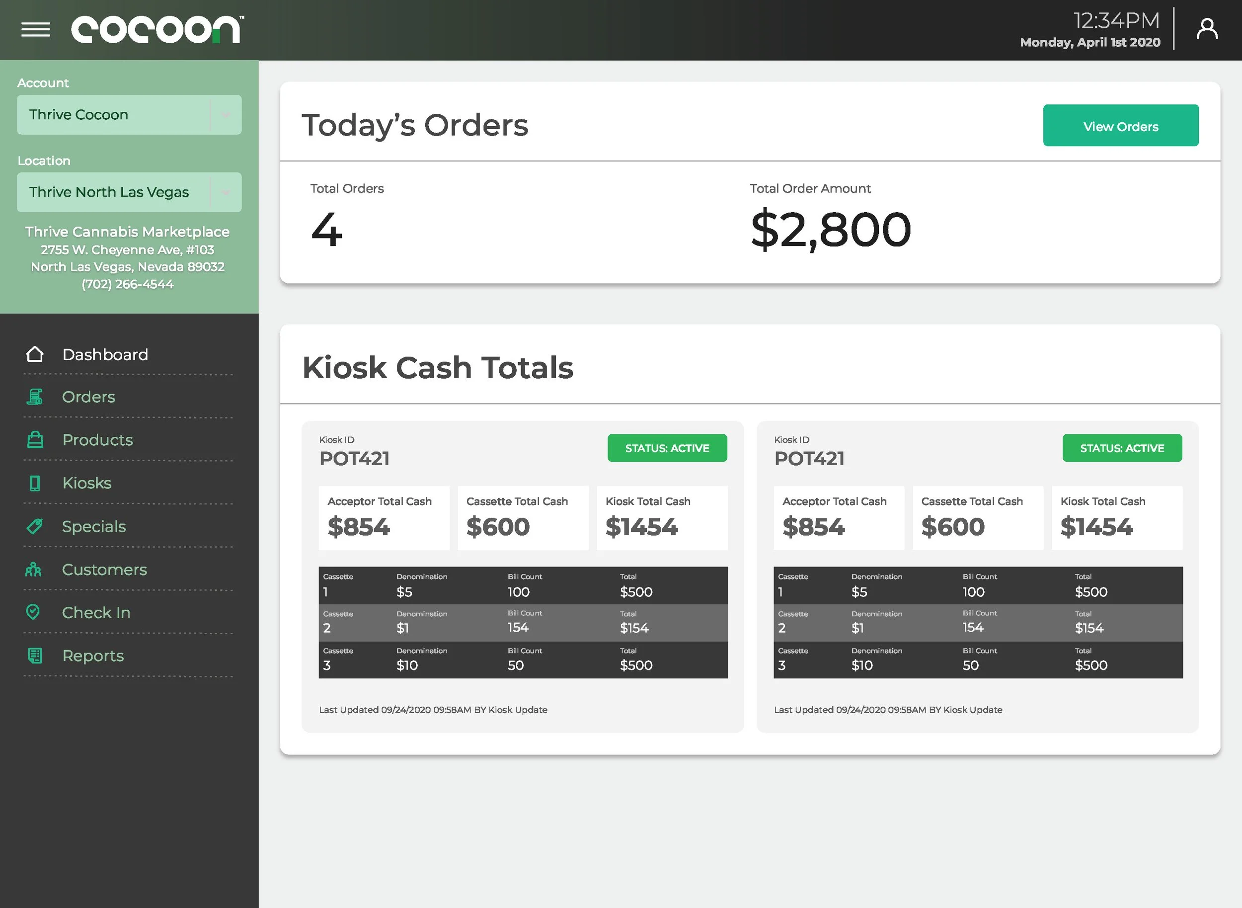
The Dashboard as Situational Awareness, Not a Data Dump
The admin dashboard could have been a table of numbers. Instead: active vs. inactive kiosks surfaced immediately, cash levels flagged before they became a problem, machine health visible at a glance. Operators needed to walk in, see everything, and know what needed attention in under thirty seconds. That requirement shaped every IA decision on the admin side.
Consumer App: Built for a Category Standard Patterns Don't Fit
Cannabis retail has unique constraints that standard eCommerce patterns don't account for: age gates, regional compliance, potency education, medical vs. recreational flows, and dispensary-level branding customization. The design had to feel as intuitive as Instacart or DoorDash while handling regulatory requirements as first-class UX problems.
Key surfaces designed:
Age Gate & Compliance Entry
Homepage & Merchandising
Product Listing Page
Product Detail Page
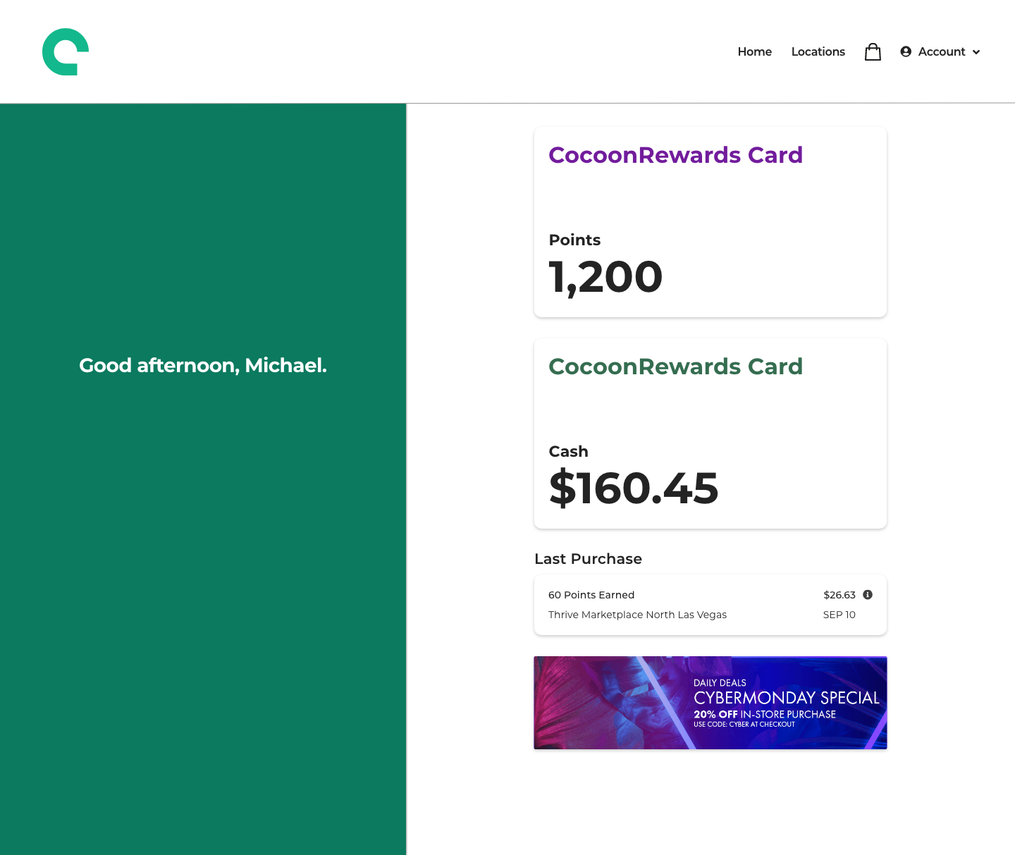
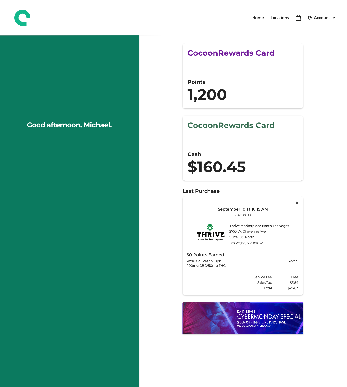
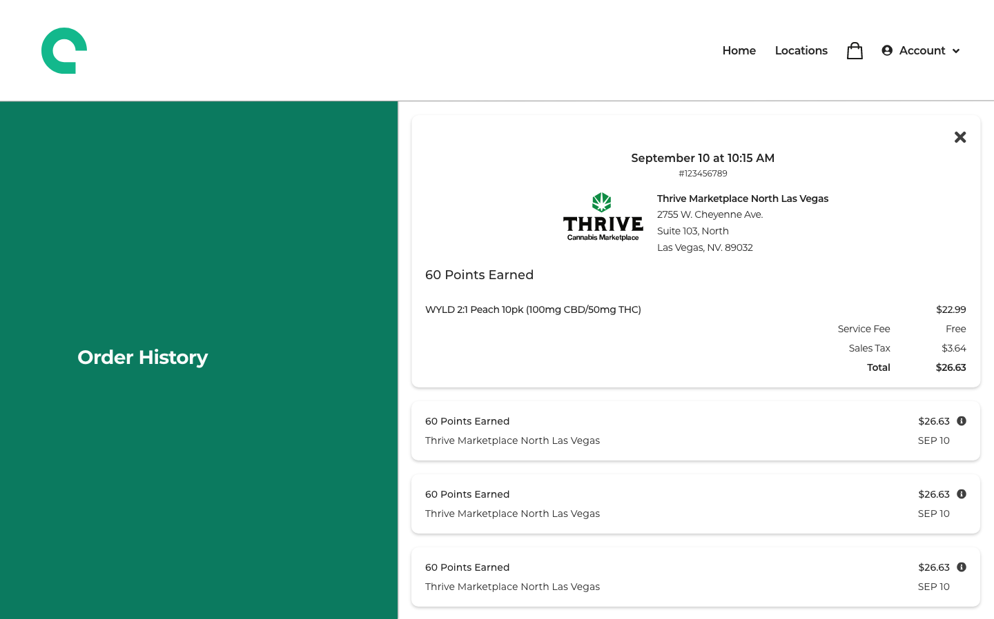
Cart & Checkout
Dispensary Theming & Customization
The theming system deserves specific mention: I designed a token architecture that let Cocoon deploy the same platform across multiple dispensary brands — custom colors, logos, hero banners, typography — without forking the codebase or compromising the core UX. That was a product systems decision as much as a design one.


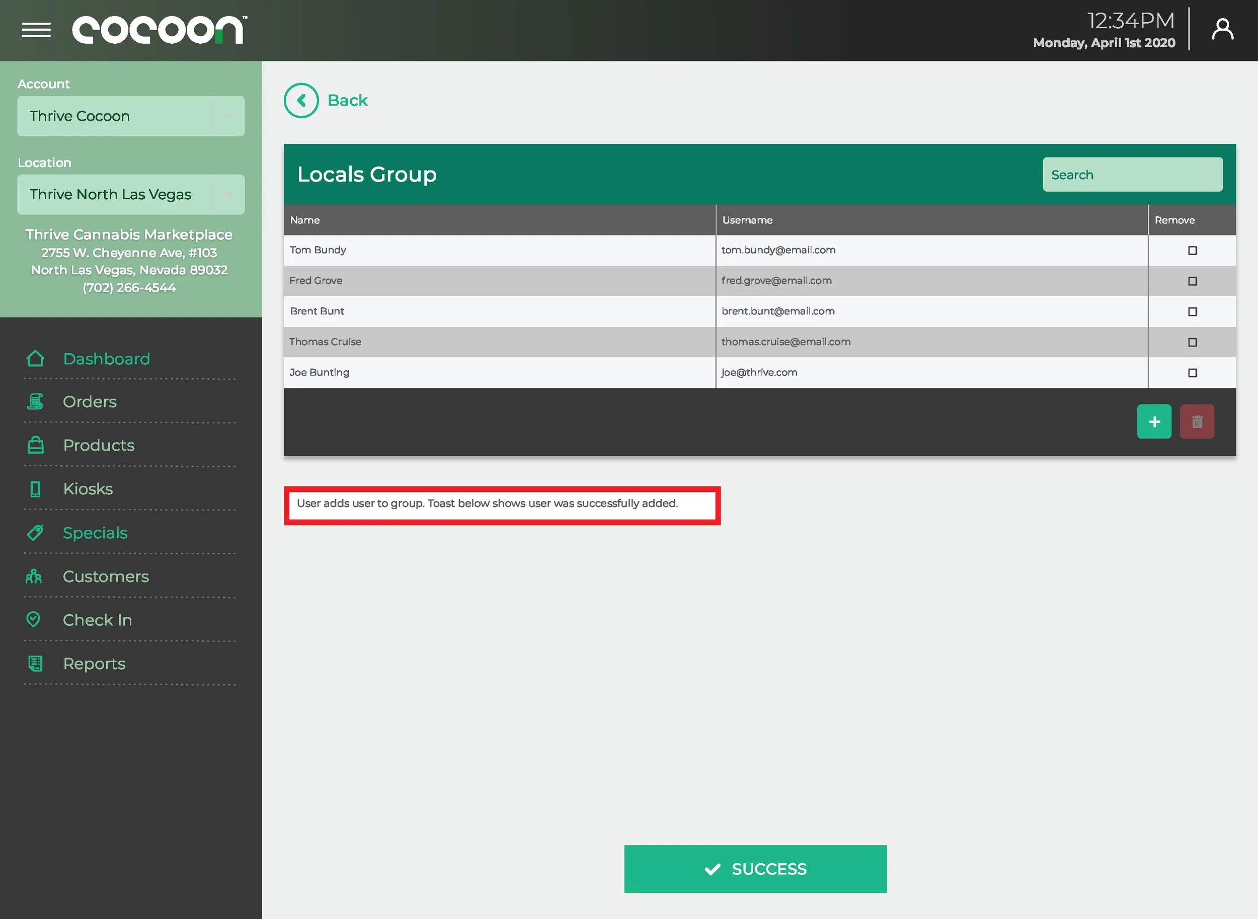
Operator Admin: A Command Center for Hardware at Scale
While customers shopped, dispensary operators, admins, and field technicians needed a unified command center. I designed the entire admin ecosystem — a desktop and mobile-responsive portal that became the operational backbone for Cocoon's clients and internal teams.
Key surfaces designed:
Real-Time Dashboard
Machine Management
Product & Inventory Manager
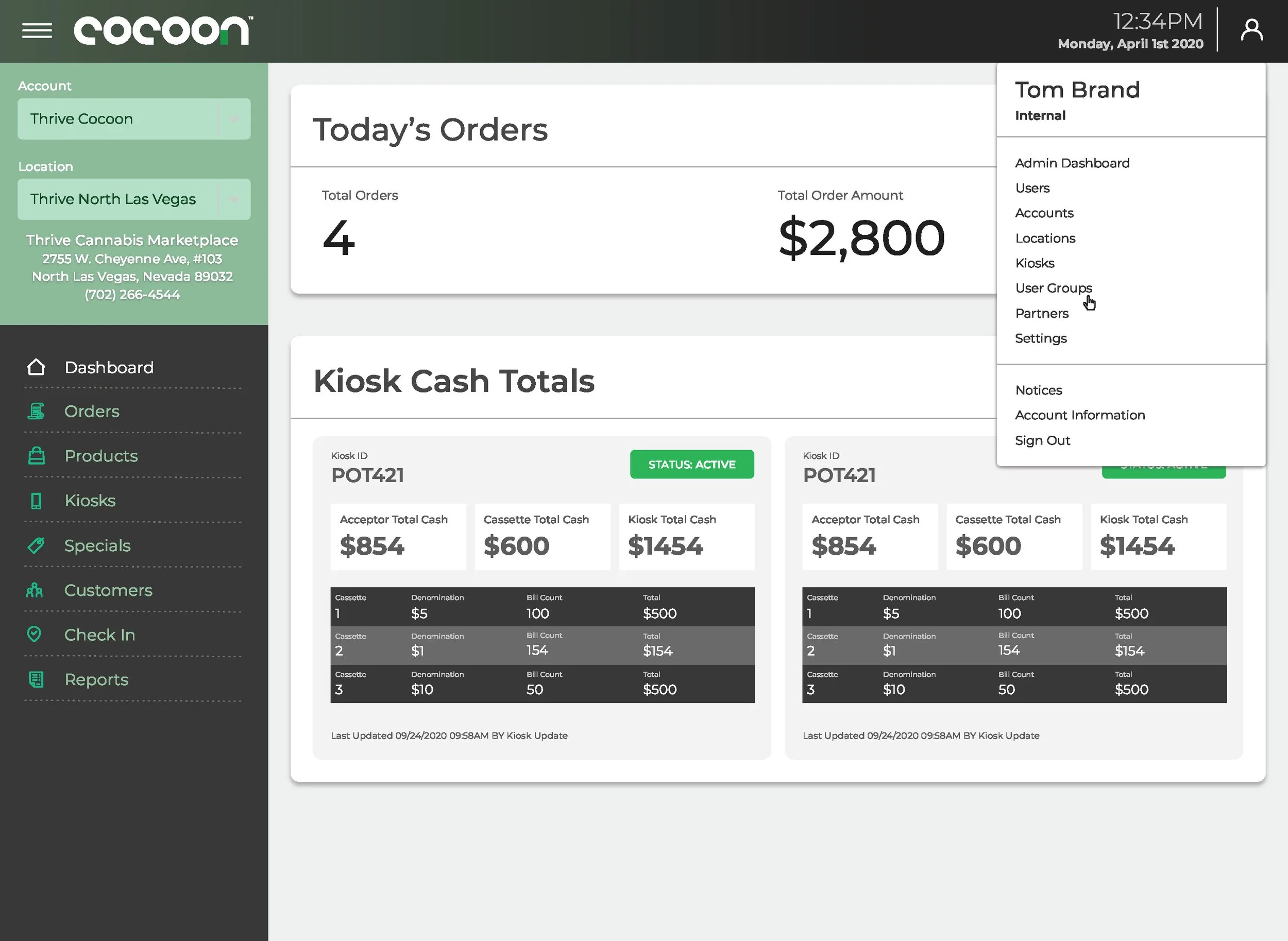
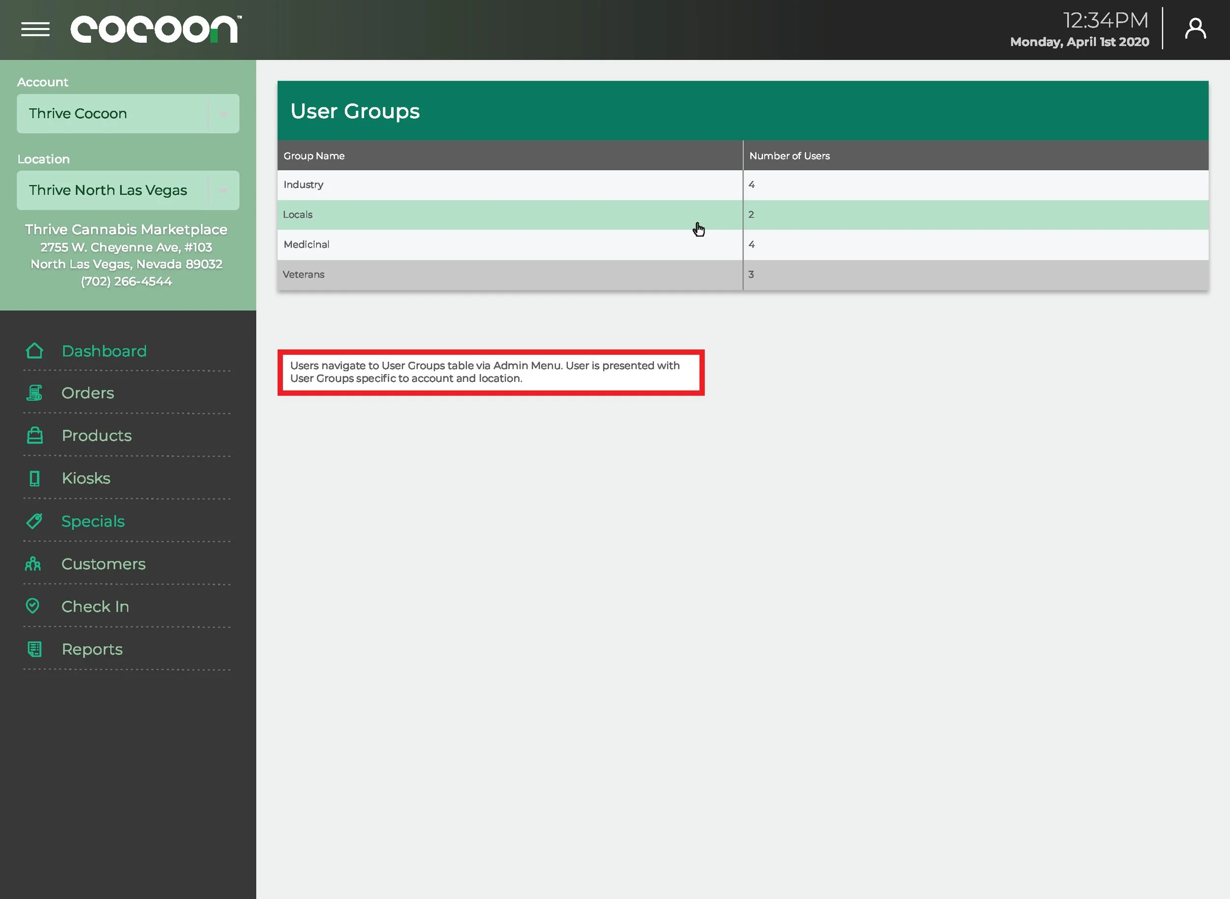
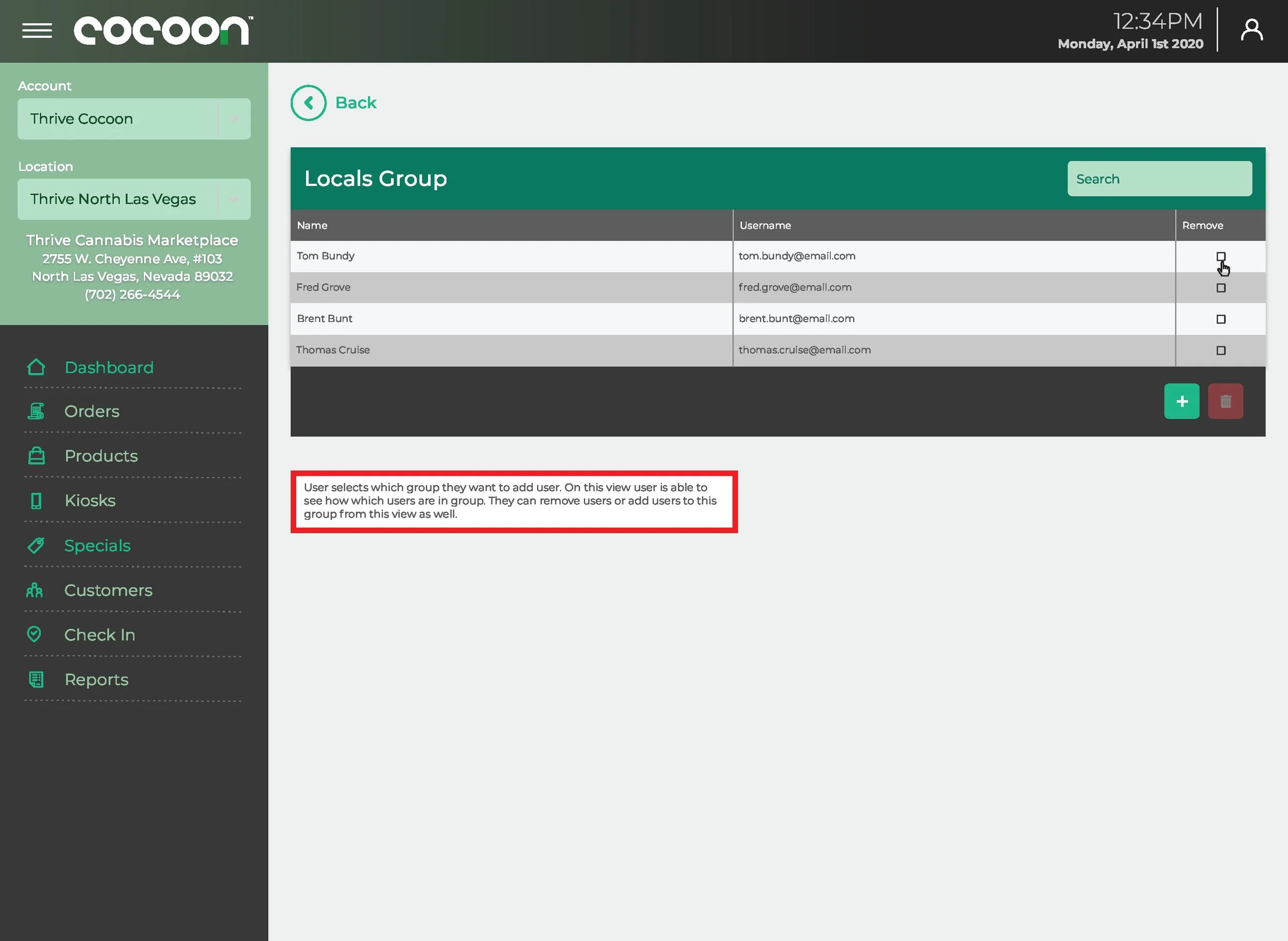
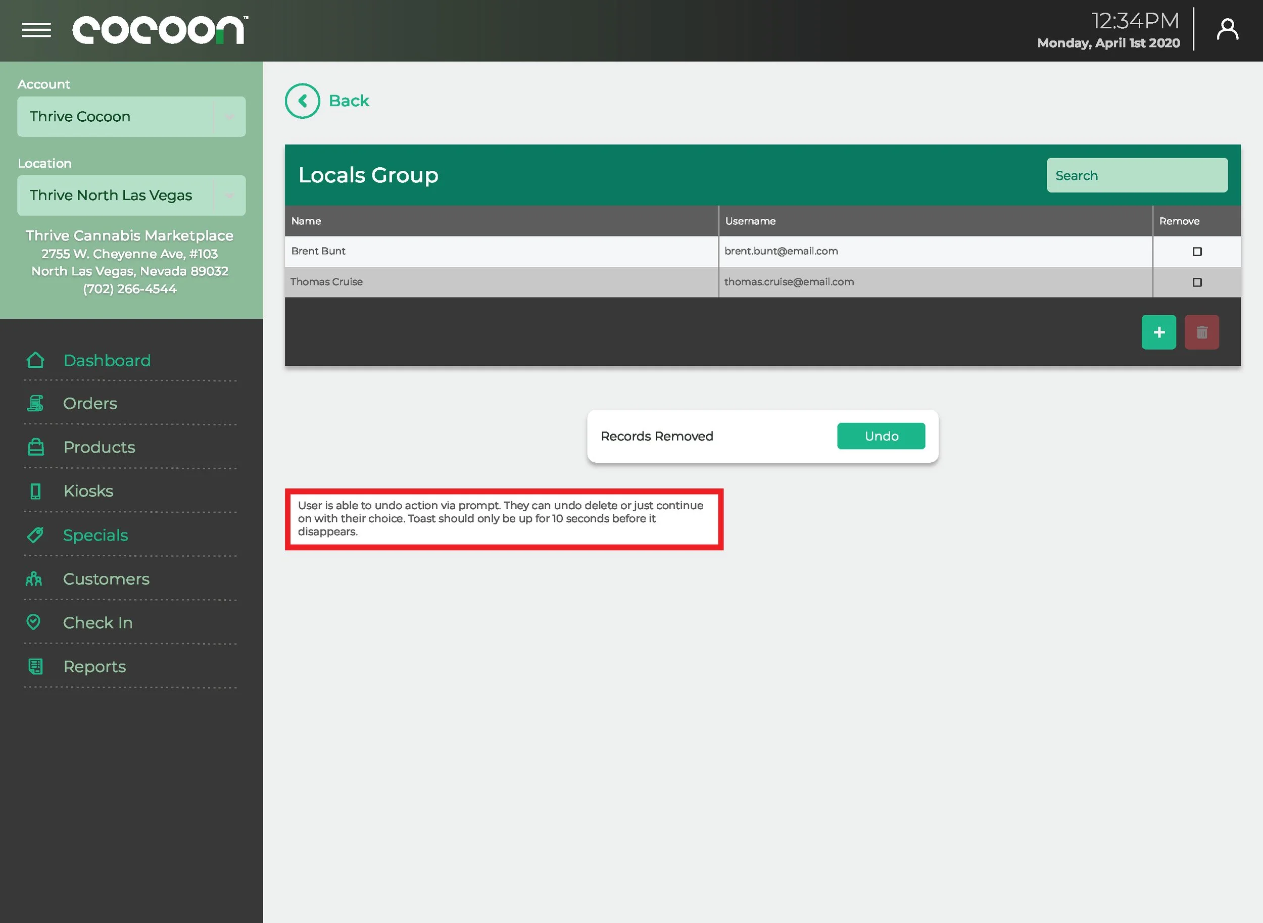
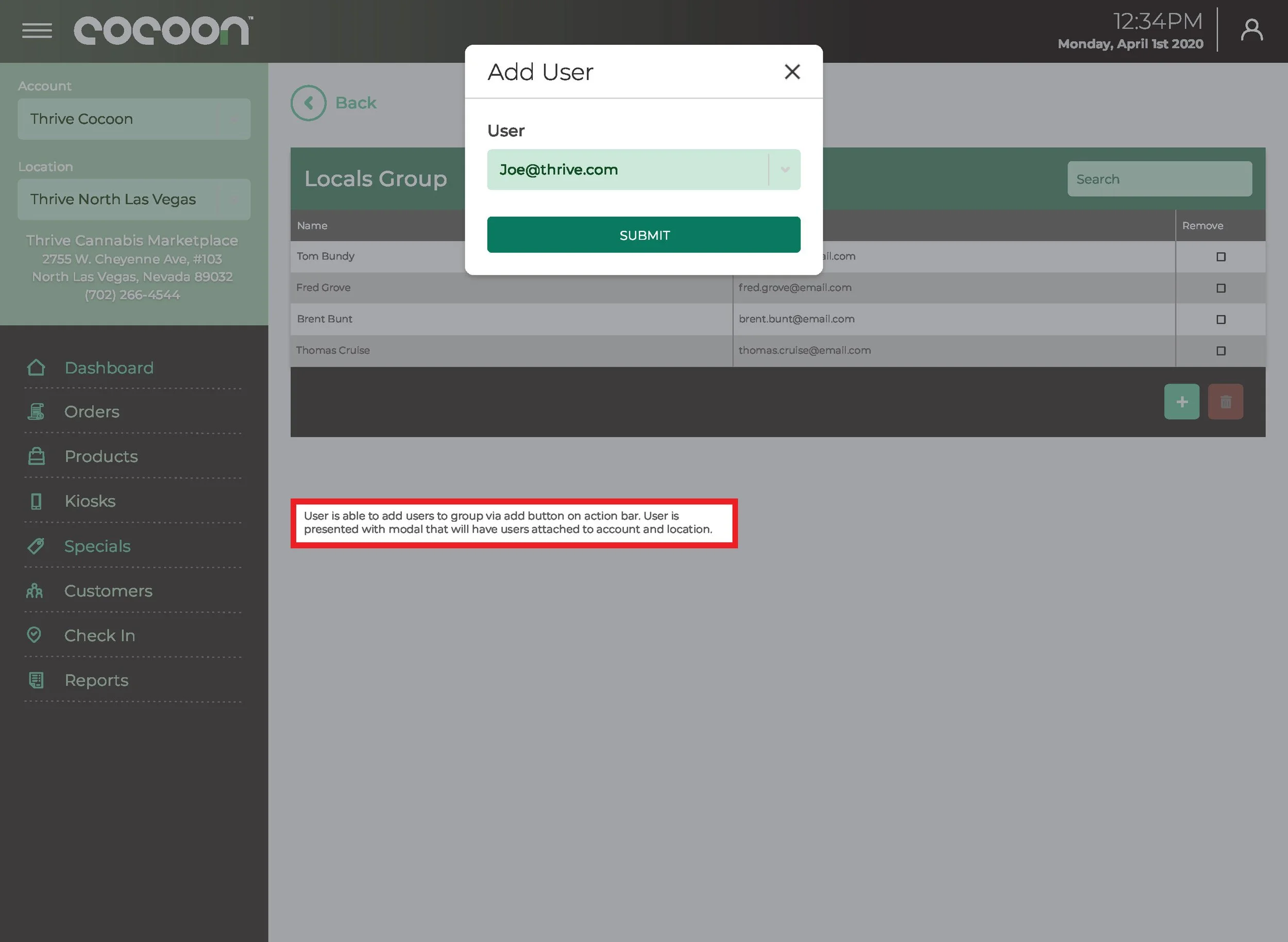
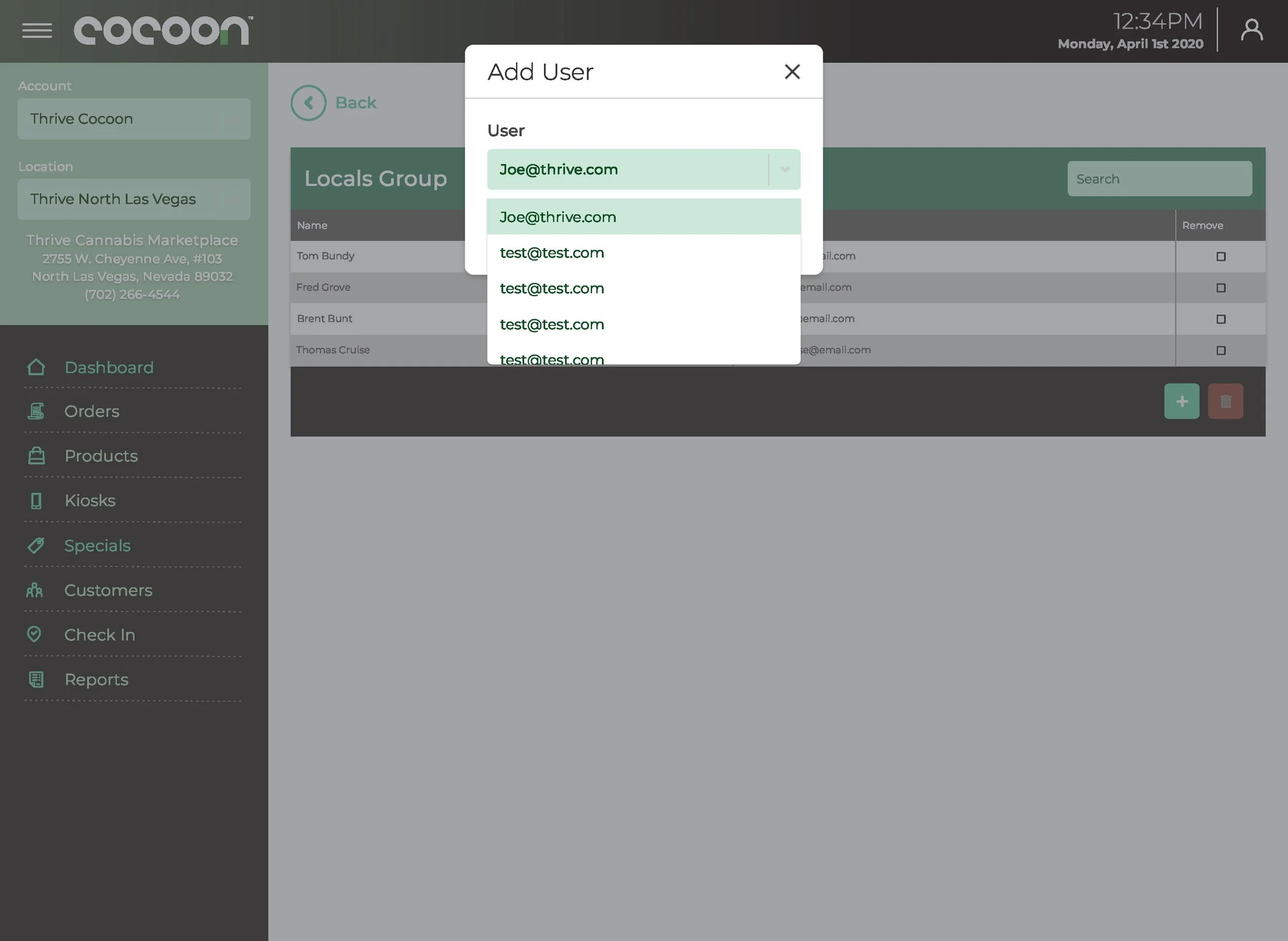
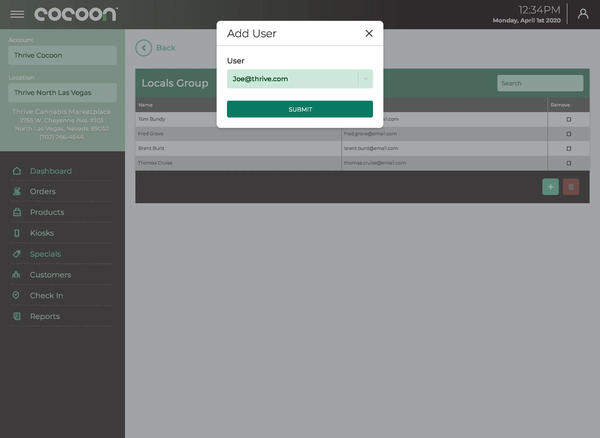
User & Permission Controls
Reporting & Growth Insights
The roles-based permission system is the piece that most reflects the organizational complexity I was designing for. Admin, Manager, Technician, and Read-Only groups each have different mental models of what the product is for. The same data — kiosk cash levels, for example — means something different to a field technician troubleshooting a machine than it does to a finance lead pulling a weekly report. The information architecture had to serve both without making either feel like they were using the wrong tool.

One Foundation. Two Distinct Expressions.
Both products were built on a shared component foundation. The intentional decisions were about what to share and what to specialize.
Shared:
color tokens
spacing system
form elements
button hierarchy
card variants
grid patterns
iconography for effects and product types
mobile-first responsive behavior.
Specialized: the consumer surface gets visual warmth and promotional flexibility; the admin surface gets data density, table components, and status indicators. Same foundation, two distinct expressions.
Building one system that served both a consumer shopping app and an enterprise operations portal — and shipping developer-ready handoff for both across React.js + API integration — is the kind of infrastructure work that doesn't show up in screenshots but determines whether the product survives past the first engineering sprint.
What Shipped and What It Enabled
Enabled Cocoon to expand from a single-channel kiosk product to a full omnichannel platform
Gave dispensary operators unified visibility into their entire kiosk fleet for the first time
Reduced operator reliance on manual tracking, spreadsheets, and disconnected tools
Built a theming system supporting multi-brand deployment from a single codebase
Delivered full developer-ready handoff for both products across React.js + API integration
Cocoon's parent company folded before production metrics could be captured. All outcomes above reflect shipped scope and operational capability, not post-launch measurement — because the business didn't make it to launch. That's the honest version.
What This Work Actually Was
I've described this project as a contract engagement. That's accurate but incomplete. In practice, I was the founding designer for two products that had never existed before — working without a design team, without prior art inside the company, and with a product scope that was still being defined while I was designing it.
The ambiguity was the job. Figuring out what the product needed to be, not just what it needed to look like, was where most of the hard work happened. That's the part that doesn't show up in the screens — but it's what made the screens possible.