Coin Cloud Wallet
Crypto's conversion problem isn't a UI problem. It's a trust problem. We fixed the trust first.
Project Details
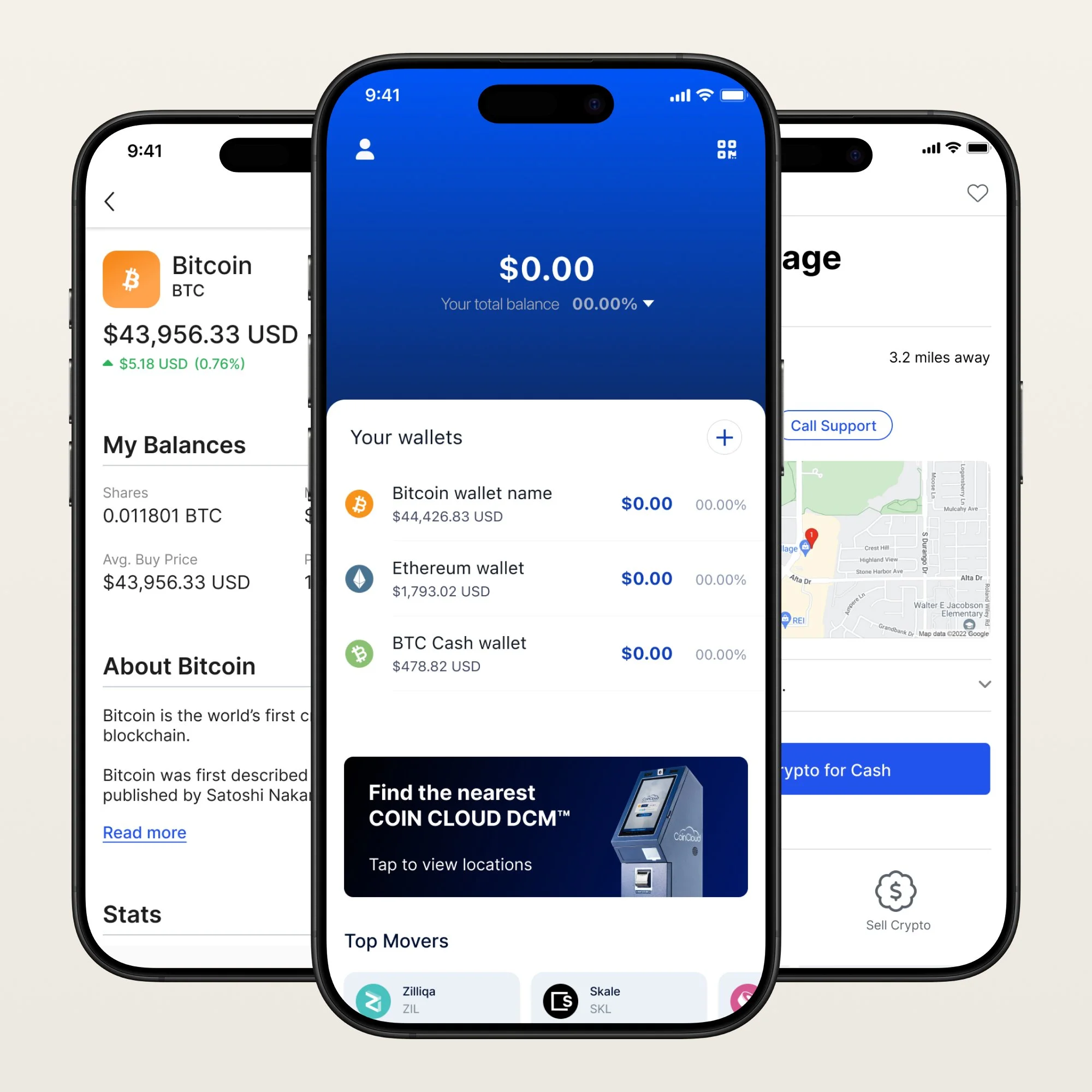
Coin Cloud operated one of the largest Bitcoin ATM networks in the US, alongside a companion mobile wallet. Two surfaces. Two form factors. Millions of users making real financial transactions.
The product needed a foundation before it could scale. It needed flows that handled money movement with clarity and compliance. And it needed an onboarding experience that could turn a first-time crypto user into a confident one.
This work covers all of it.
Role: Staff Product Designer - End-to-End Product
Client: Coin Cloud
Industry: Fintech / Crypto
Scope: Design System · Mobile UX · Transaction Flows · Compliance Patterns · Research & Analytics · Mixpanel
The Problem
I got recruited by my former manager who needed someone to get their wallet off the ground. What I found when I got there was three designers, three platforms, and nobody focused on the same thing. The kiosk machines drove the business. The wallet was supposed to be the future. Nobody was fully committed to either.
The wallet I inherited was built on a purchased design system someone had tried to customize into something it wasn't. The foundation wasn't ours and the pieces didn't fit together. My job was to build structure out of that and get a real product moving.
The harder problem showed up when the company decided to go legit. KYC compliance was the right call legally. It was also the thing their users didn't want. Crypto in 2021 attracted people who specifically didn't want to be tracked. The moment we implemented identity verification, the drop-off was immediate and real. The CEO wanted to roll it back. We pushed back. Eventually reality won and we found a middle ground that wasn't anyone's first choice.
The wallet never made it to production. The company folded before it shipped. What I built was the foundation — the onboarding, the transaction flows, the compliance patterns — for a product that ran out of time.
What I didn't mention is that I spent most of that year fighting to understand a market I knew absolutely nothing about. Crypto compliance, KYC regulations, how people actually think about moving money digitally for the first time. Nobody handed me a brief on any of it. I had to go find it.
The Foundation
I've seen what happens when teams build the design system last. You end up chasing inconsistencies that are already in production and trying to retrofit structure onto something that was never built for it. I wasn't going to do that here.
Two surfaces — mobile wallet and physical ATM kiosk — had to feel like the same product to someone moving between them with real money. If the experience drifted between surfaces, the user's confidence drifted with it.
So I built the foundation first.
Semantic token architecture across color, typography, spacing, and components. Every token named for what it does, not what it looks like.
Colors covered Primary, Secondary, Surface, Blacks and Grays, Error, and Success states. Typography ran Inter across nine levels from xs to Display, each weight relationship tuned for the moments in a financial flow where clarity matters most. Components covered buttons, toggles, inputs, icons, markers, and crypto asset symbols — full state coverage, documented for handoff, nothing in there that wasn't actually going to get built.
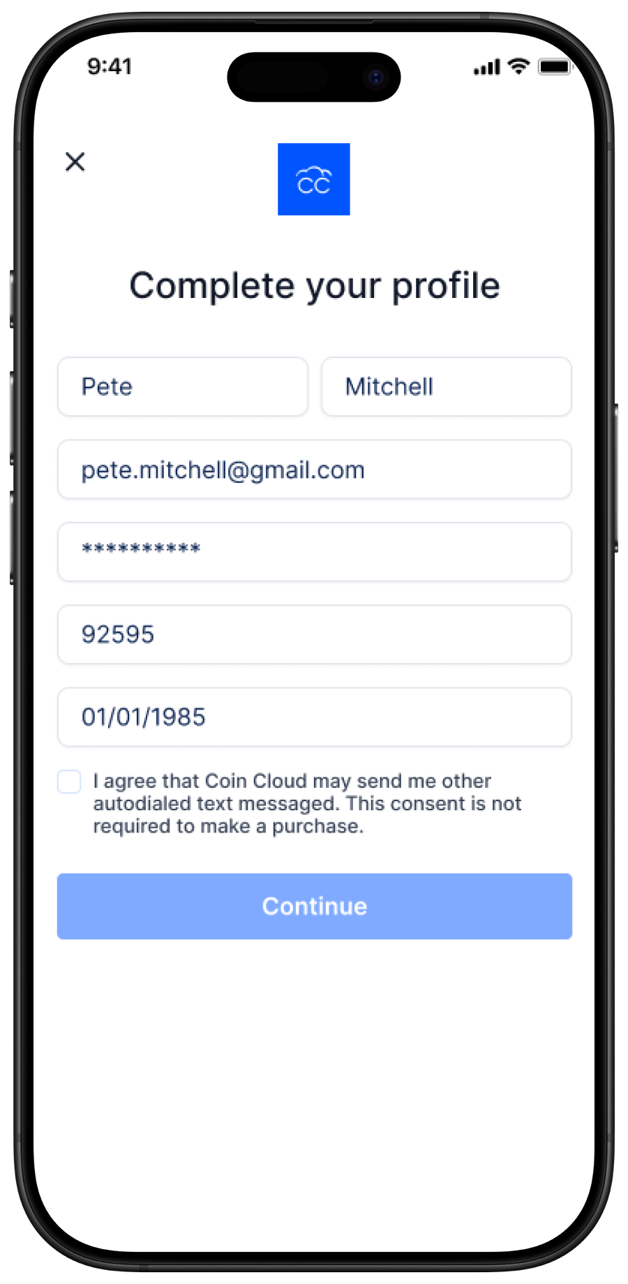
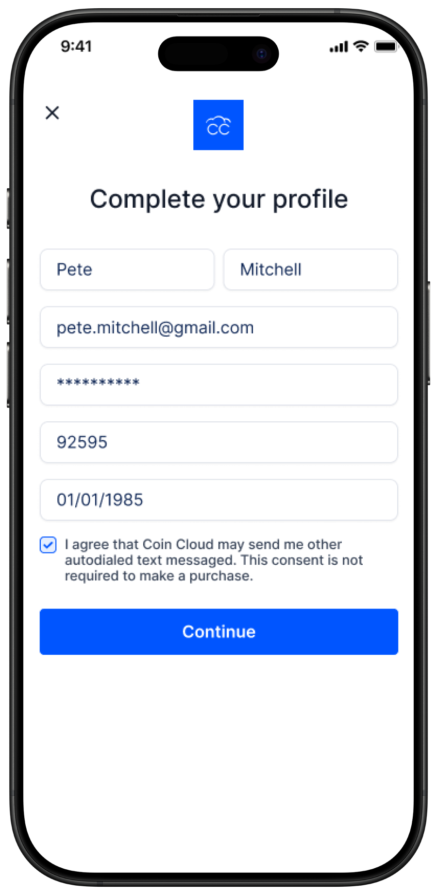
Onboarding
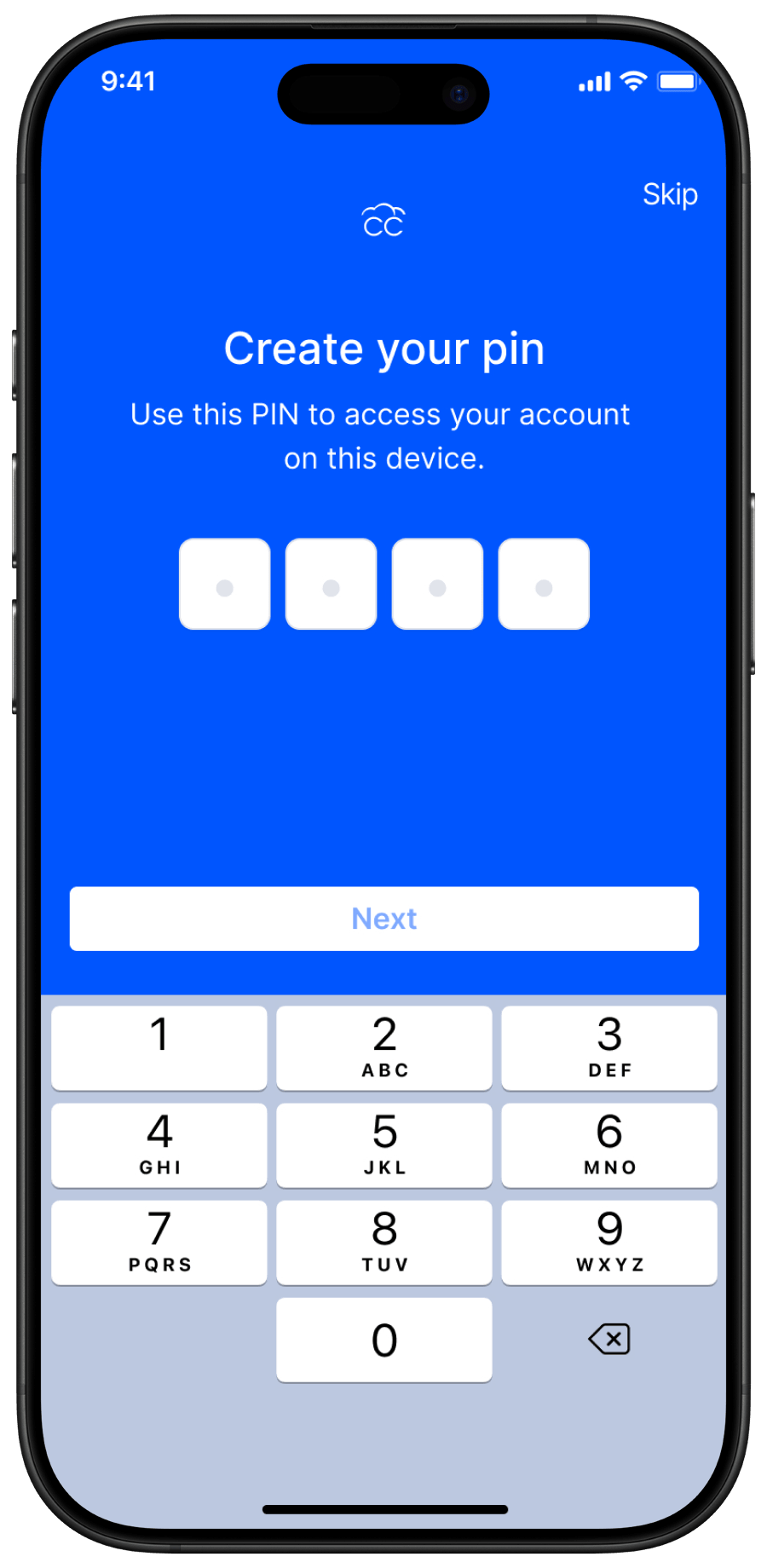
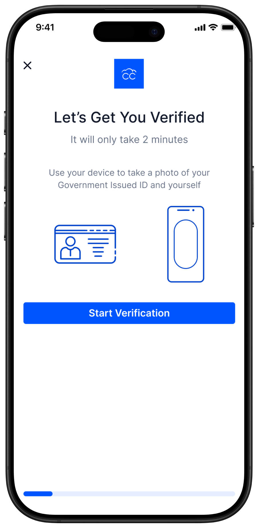
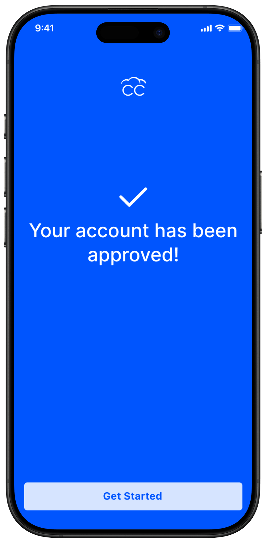
The first transaction a user completes isn't the buy. It's the account.
Most crypto products treat onboarding like a checklist — get through it, get to the product. I treated it like the product's first argument for why you should trust it with your money.
Two complete flows built from launch screen to account approval.
Default Flow
Launch, Welcome, Phone/Email Login, Verification, Account Creation, Email Verification, PIN, Face ID, User Verification, Account Approved. Every step designed. Every error state accounted for. Every moment where a first-time user might hesitate got a reason to keep going.
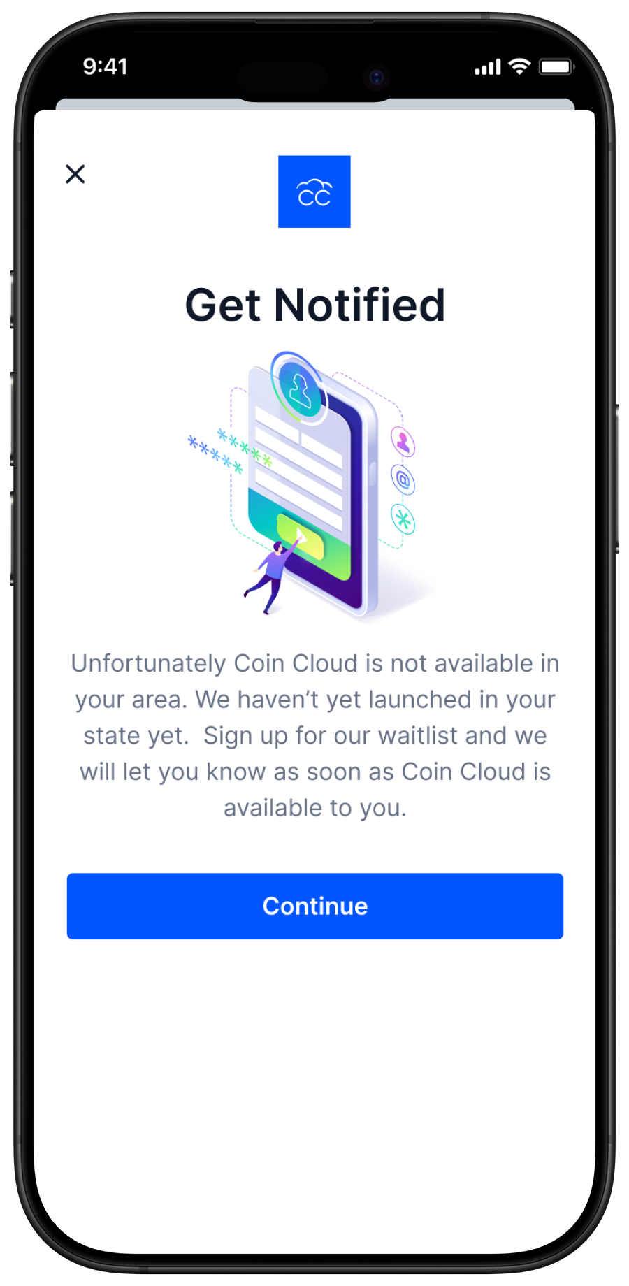
Product Not Available Flow
This one mattered more than it sounds. When Coin Cloud wasn't available in a user's region, the experience had one job: tell them clearly without making them feel like they wasted their time. I've seen products handle this with a dead end. A dead end is a user you don't get back. A graceful response is a user who remembers you got it right and comes back when the product is available to them.
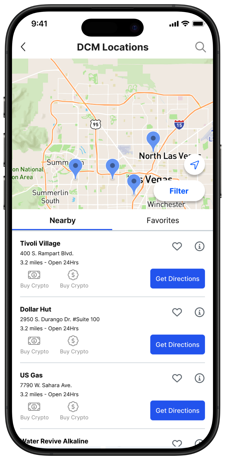
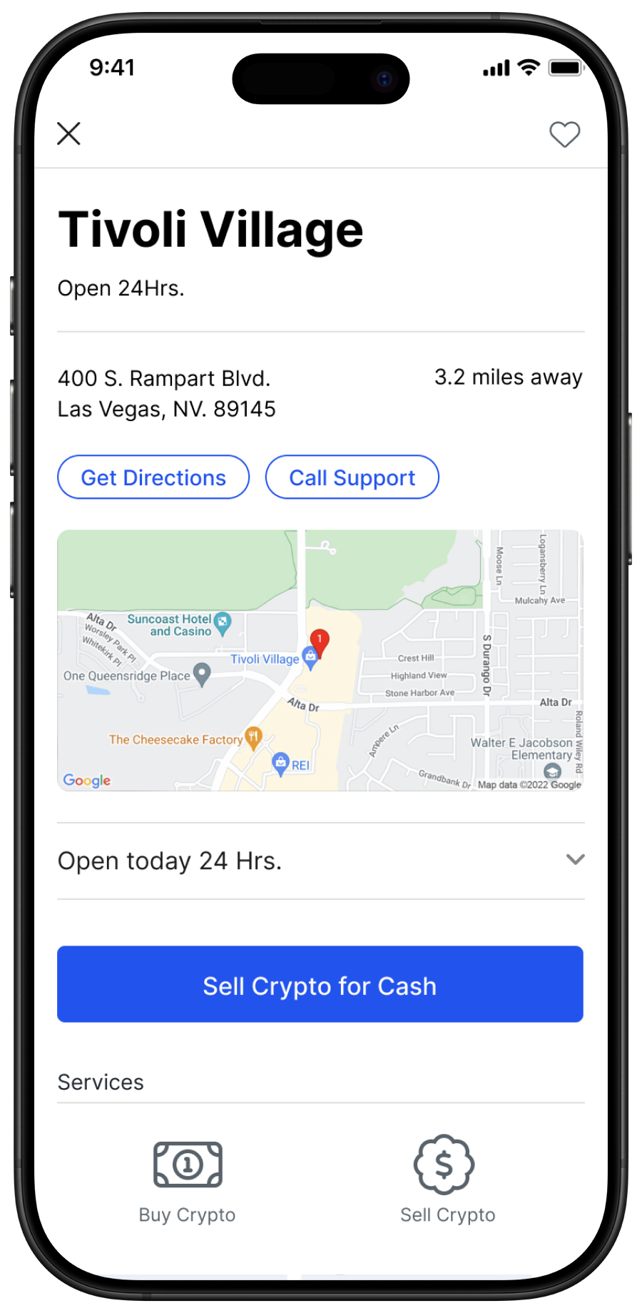
Locations
The ATM network was Coin Cloud's biggest competitive advantage. Thousands of machines. Real cash in, real crypto out. No pure-digital competitor could replicate that physical presence.
But none of it mattered if a user couldn't find the nearest machine without getting frustrated and giving up.
I designed the Locations feature end to end — map view, list view, favorites with empty state, a filter system with applied and unapplied states, a location detail sheet with directions and support access, and search with suggested results.
The empty states got the same attention as the populated ones. Empty favorites. Zero search results. A machine temporarily out of service. These are the moments where a user decides whether they can rely on the product or not.
When we pulled the Mixpanel funnel data the drop-off wasn't random. It was concentrated — specific steps, specific moments where users hit something they didn't understand or didn't trust and left. Random abandonment means the problem is everywhere. Concentrated abandonment means it has an address.
We ran 50+ usability sessions alongside the funnel analysis. The sessions explained what the data was showing. The data measured whether the fixes actually worked. Without both you're just guessing.
The metrics are attributed to the kiosk transaction flows where the data was captured. The wallet was being built in parallel and never reached production before the company folded.
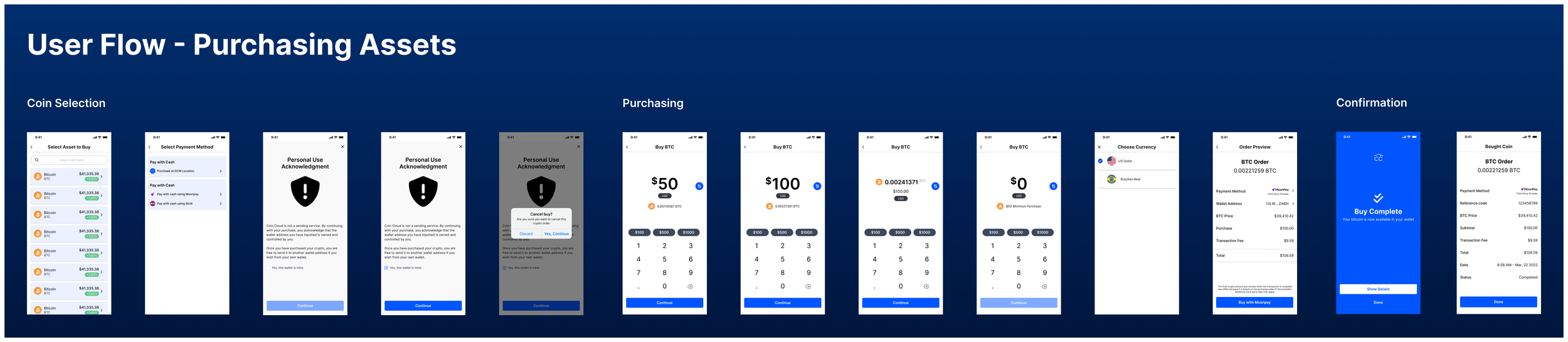
Buy Flow
Asset selection, payment method, personal use acknowledgment, amount entry with quick-select options, minimum purchase state, currency selection, order preview, confirmation. Every step went through the sessions. Every friction point got addressed before it hit production.
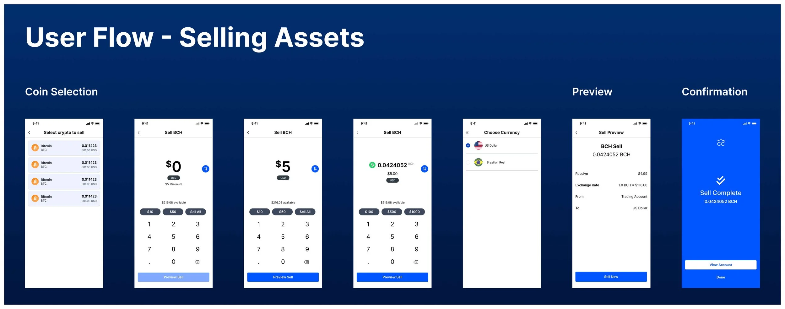
Sell Flow
Asset selection, amount entry with available balance displayed, sell preview, currency selection, complete. Same rigor as the buy flow, designed as its mirror.
The compliance gate was its own problem. The personal use acknowledgment modal is a legally required disclosure. It can't be removed and it can't be buried. The job was to make it honest without making it feel like an accusation — clear enough for a regulator, proportionate enough that a user with nothing to hide doesn't feel like they're being treated like they do.
That's what designing in a regulated environment actually looks like.
Transactions
Settings
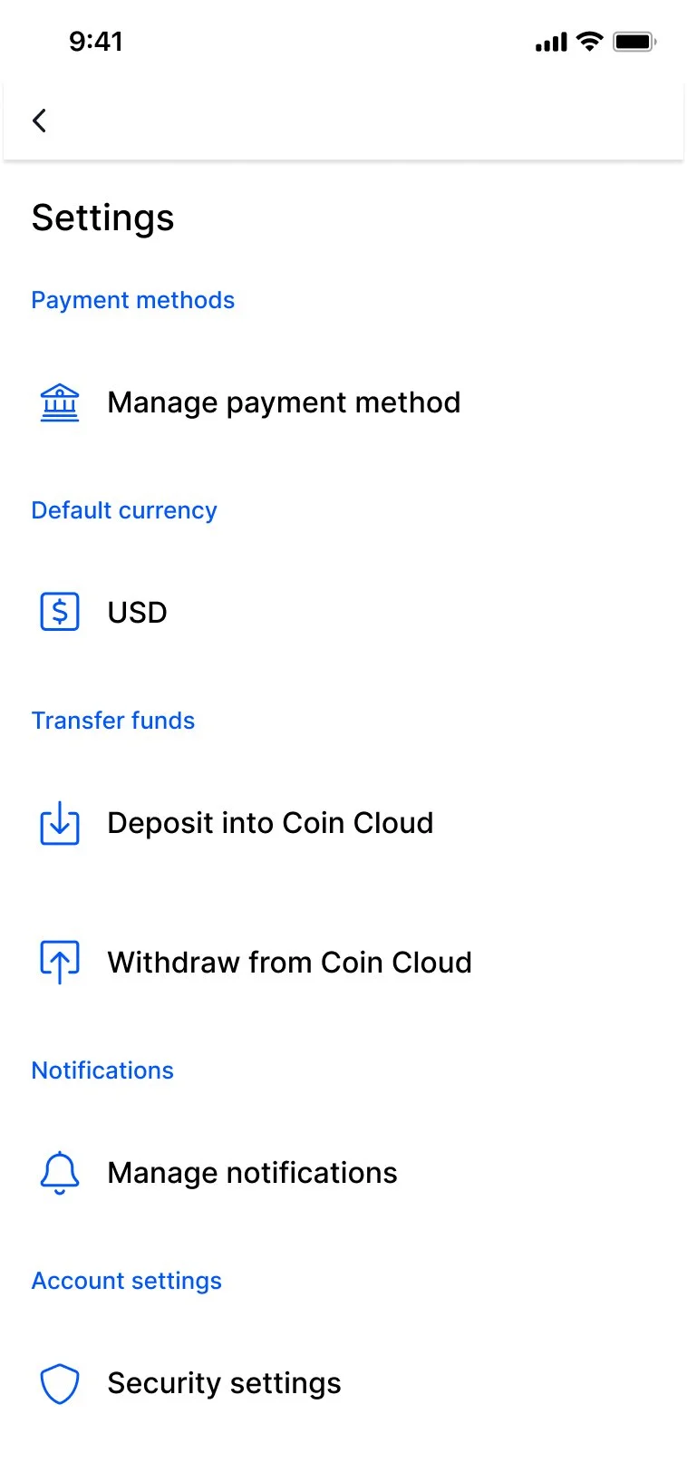
Settings is where users manage their money, their security, and their ongoing relationship with the product. It's not a secondary surface. It's where trust gets maintained after the transaction is done.
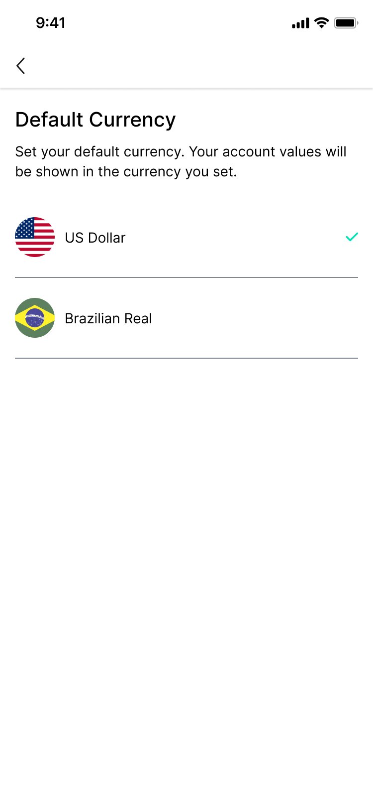
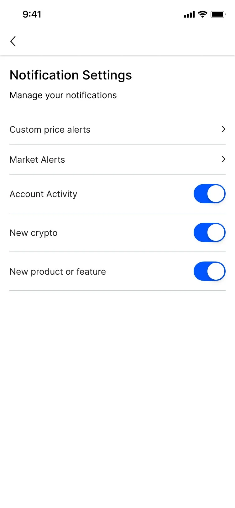
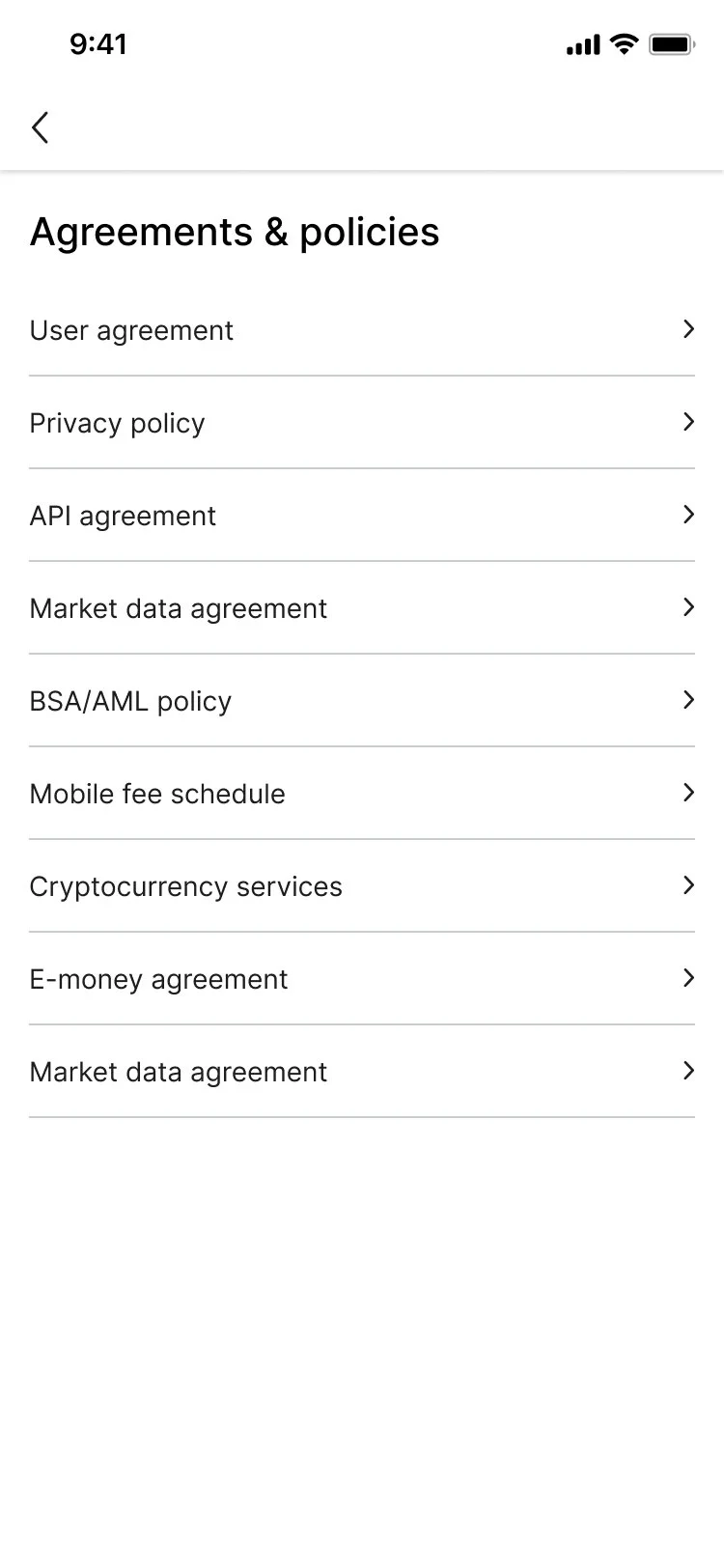
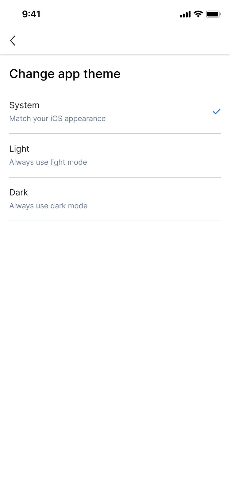
I designed across eight areas — payment methods, default currency, notification preferences, security settings, statements and history, agreements and policies, app theme, and support.
Every section consistently structured. Every option clearly labeled. No buried toggles. No ambiguous language around anything security related. If a user is trying to remove a payment method or pull a statement, the product should make that straightforward. A product that makes it hard to understand what's happening with your money is a product people stop trusting.


Dashboard
The dashboard brought it all together — wallet balances across multiple assets, top movers, and a direct ATM finder CTA connecting the mobile experience to the physical network.
Most teams design the populated state and call it done. The empty state is the one that gets skipped. I didn't skip it.
The first time a new user completes onboarding and lands on the dashboard they have no balance, no history, nothing. That screen is the product's first impression of what their life looks like when this works. An empty state that looks like an error is a missed opportunity. One that shows the shape of what's coming keeps them moving forward.
In Closing
I spent a year learning an industry I didn't know, building a product on a foundation that wasn't mine, inside a company that was figuring out its own identity at the same time I was figuring out the product.
The wallet never shipped. The company folded before it got there. But what I built — the system, the flows, the compliance patterns, the onboarding — was real work done under real pressure with real constraints.
That's the job most of the time. Not a clean brief and a willing team. Just a problem that needs structure and someone willing to go find what's missing.